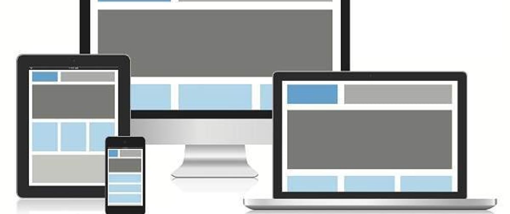
What is Responsive Web design?
Responsive Web design is the approach that suggests that design and development should respond to the user’s
behavior and environment based on screen size, platform and orientation.
Meta Tag
The width property controls the size of the viewport. It can be set to a specific number of pixels like width=600 or to the
special value device-width, which is the width of the screen in CSS pixels at a scale of 100%. (There are corresponding height
and device-height values, which may be useful for pages with elements that change size or position based on the viewport height.)
<meta name="viewport" content="width=device-width; initial-scale=1.0">
Page Widths
Say you’re looking to provide three different responsive page layouts: one for desktops, one for tablets (or laptops), and one for
smartphones.Unfortunately, there’s no defined standard for the page widths to target, but the following example responsive values
are often used:
    320px
    480px
    600px
    768px
    900px
    1024px
    1200px
With any of these reasonable sets of increments, you can target most devices. In practice, there is usually no need to
separately handle all of the aforementioned examples of page widths seven different resolutions is probably overkill.
Which devices should I target?
The purest answer is none of them.
More and more devices are going to come to the market and it seems silly that a device with 767px assumes a 480px
design because that’s where you set the breakpoint. Instead if it were set at 800px and again at
600px (or at what ever point the design looked bad) then you cover ANY device that comes along next week, and years into the future.
Mobile First
Approaching the design mobile first is the best approach for a responsive design. It allows you to layout the
content that is most important to your customers in a clear and logical way on the smallest screen real-estate.
This will force you to really identify what is the most important information on your site.
Media Queries
CSS3 supports all of the same media types as CSS 2.1, such as screen, print and handheld, but has added dozens of
new media features, including max-width, device-width, orientation and color. New devices made after the release of
CSS3 (such as the iPad and Android devices) will definitely support media features. So, calling a media query using
CSS3 features to target these devices would work just fine.
Common Breakpoints:
    320px — 480px: Mobile devices
    481px — 768px: iPads, Tablets
    769px — 1024px: Small screens, laptops
    1025px — 1200px: Desktops, large screens
    1201px and more —  Extra large screens, TV
Syntax
@media media type and (condition: breakpoint) {
  // CSS rules
}


Top comments (0)