
What is Flexbox?
Flex box is a CSS web layout model, it allows responsive elements to be rearranged depending on screen size. The main axis of flex has four different directions: Row, Row-reverse, Column, and column-reverse. To start using flex box we first have to define a flex container. Here we have a flex container with three flex items. We do this part in HTML.
<div class="flex-container">
  <div>1</div>
  <div>2</div>
  <div>3</div>
</div>
What is Flexbox in CSS?
Now that we have seen how to target what we want to use flexbox with, we can hop into the CSS! In CSS, flexbox has 6 container properties:
display
flex-direction
flex-wrap
flex-flow
justify-content
align-items
align-content
Each of these properties does their own thing. Flex-direction stacks items. Flex-wrap specifies if items should wrap or not. Flex-flow is a shorthand property for setting both the flex-direction and flex-wrap properties. Justify-content is used to align the flex items along with align-items and align-content doing the same.

In this image you can see a draft of how my partner and I are putting together a food website with flexbox by moving around recipe cards.
Basic parts
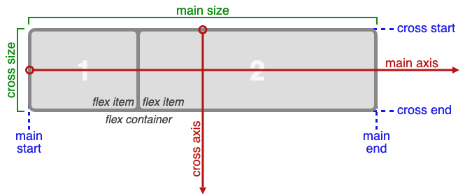
There are 5 Basic parts of Flexbox. We have main-axis which is the main axis of a flex container. Next we have main-start/main-end in which the flex items are placed and can be moved starting on the main-start and going toward the main-end side. After this one we have main-size which helps determine the width or height of the flex item. Cross-axis is the next one and it is very similar to main-axis because it is perpendicular to it. Cross-size in the width or height of a flex item.
Starting the Website
After we had our draft down we started to work on our website with some starting HTML code that consisted of Recipe-Cards. We wanted to make our website look just like our figma design so we used HTML to make Recipe-cards and then used Flexbox in CSS to move them and style them how we wanted. Here is an example of the Recipe-card:
 <div class="recipe-card">
      <img src="./Images/Croissant_2.jpg" alt="">
      <div class="recipe-info">
        The highest quality most delicious croissant!
         <a href="https://bakingamoment.com/easy-homemade-croissant-recipe/">recipe</a>
      </div>
    </div>
Once the HTML was looking crisp we had to sharpen it up with some CSS. In our CSS we use Display: Flex, Flex-direction, Flex-wrap and Align-Content Here is what is looked like in the end.
.recipe-card{
  display: flex;
  flex-direction: column;
  height: 450px;
  width: 400px;
  background-color: black;
  flex-wrap: wrap;
  align-content: space-between;
  margin: 10px 15px;
}
After we finished putting together the CSS and HTML we added some hyperlinks that took you to a recipe page that shows you how to cook the food you clicked on. Here is the final product.

Conclusion
In conclusion Flexbox is a very good alternative to something like float where it gives you the advantage with layout. Obviously something like CSS grid is also very good for arranging things in multiple rows but for now we are only using single rows with the property justify-content, I think that Flexbox is the best way to go.


Top comments (0)