Hi Devs, Its my first time writing here. I wish to share how I made a GlassMorphic Profile Card, and How you can make it just using HTML, CSS .
Prerequisite : Basic knowledge of HTML, CSS
I used Codepen to make this, coz i just find it convenient that I can just click on "New Pen" and start coding.
So, lets not waste any time and start with making the actual thing.
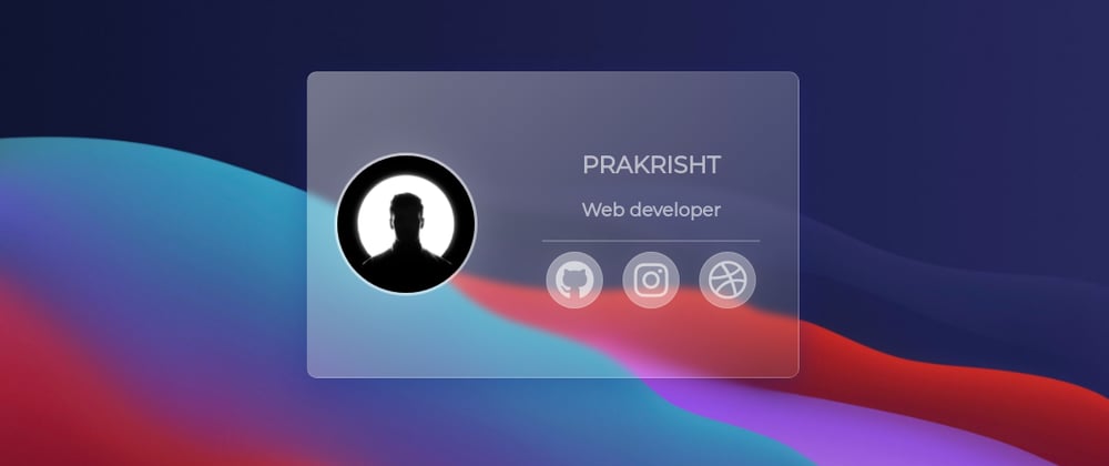
Here is what you will have at the end Link to Codepen that I made
First, we will start with a normal html document, now lets attach the libraries we will need.
1. Font-Awesome
<head>
  <link rel="stylesheet" href="https://cdnjs.cloudflare.com/ajax/libs/font-awesome/4.7.0/css/font-awesome.min.css">
  <script src="https://kit.fontawesome.com/a076d05399.js"></script>
</head>
Copy this or simply copy the latest version from Font-Awesome website.
Now,
- Adding a div element and centering it.
<div id="main"></div>
#main{
  max-width: 500px;
  height:310.5px;
  margin:auto;
  margin-top:140px;
}
Height and width are totally subject to your needs, after that we horizontally centered div using "margin:auto" and then gave it a lil top margin.
2.Now, lets add two partitions to our main div.
one for Photo and one for Info.
<div id="main">
  <div id="photo">

  </div>
  <div id="info">

  </div>
</div>
now, we can use grid layout to position our photo div and info div nicely inside the main div.
#main{
  max-width: 500px;
  height:310.5px;
  margin:auto;
  margin-top:140px;
  display:grid;
  grid-template-columns:40% 60%;
}
by doing this , we gave 40% width to photo div and 60% width to info div.
3.Lets style our main card and add a background image.
#main{
  display:grid;
  grid-template-columns:40% 60%;
  max-width: 500px;
  height:310.5px;
  margin:auto;
  margin-top:140px;

  background: linear-gradient(-45deg,rgba( 255, 255, 255, 0.1
  ),rgba( 255, 255, 255, 0.4 ));
  box-shadow: 0 8px 32px 0 rgba( 31, 38, 135, 0.37 );
  backdrop-filter: blur( 4px );
  -webkit-backdrop-filter: blur( 4px );
  border-radius: 10px;
  border: 1px solid rgba( 255, 255, 255, 0.18 );
}
We just added a diagonal linear gradient of two almost transparent colors to the background.
then, a background blur filter, this will make it look more like glass.
Border-radius to make the card look more and a border to create the fine line we have at glass corners.
and the Box Shadow gives the illusion of depth.
body{
  background-image:url('https://cdn.osxdaily.com/wp-content/uploads/2020/10/macos-big-sur-wallpaper-2-scaled.jpg');
  background-repeat: no-repeat;
  background-attachment: fixed;
  background-size: cover;
}
I am sure you can recognize the Big Sur Dark wallpaper that i use as the background.
Now, your card should start looking more like a card.

Styling the card is almost done, now you can add to the card, whatever you want, but for this particular post, we are working on a profile card, so lets get with it.
4.Lets add your photo and style it to look good.
I took a dummy image from unsplash , You should use your photo in this.
<div id='photo'>
      <img src='https://images.unsplash.com/photo-1544502062-f82887f03d1c?ixid=MnwxMjA3fDB8MHxwaG90by1wYWdlfHx8fGVufDB8fHx8&ixlib=rb-1.2.1&auto=format&fit=crop&w=1427&q=80' id='profilepic'>
</div>
#profilepic{
  height:140px;
  width:140px;
  box-shadow: 0 0 42px 0 rgba( 255, 255, 255, 0.17 );
  background: rgba( 255, 255, 255, 0.25 );
  backdrop-filter: blur( 4px );
  -webkit-backdrop-filter: blur( 4px );
  border: 3px solid rgba( 255, 255, 255, 0.18 );
  border-radius:50%;
  object-fit: cover;
  object-position: 50% 10%;
}
#photo{

  display: flex;
  justify-content: center;
  align-items: center;
}
Here, we used a flex display for photo div and we added an image tag with the image on it.
image is aligned into the middle using justify-content and align items.
[this is nice about flex, alignments are easier]
now, the styling of photo is also pretty much understandable from how we made main card into glass.
what's new is the border radius, and you must know that
" border-radius:50% ; " means a circle.
Well, You have done everything alright if your card looks something like this.

If everything is good till now, lets move on to next step.
5.Now lets give the card your name and add some contact links.
You will have to choose a font now, I choose Montserrat, and I prefer you to choose the same, but, no bars, let your imagination run wild and try if some other fonts can make it look better.
Copy the import tag from Google Fonts
@import url('https://fonts.googleapis.com/css2?family=Montserrat:wght@400&display=swap');

body{
font-family: 'Montserrat', sans-serif;
}
lets write some names now
<div id='info'>
<div id='name'>
        <h2>[Your name] </h2>
        <h3>[Your designation]</h3>
</div>
<div id="contacts">
</div>
</div>
I divided info div into two. One for name and another for contact links.
now, add some links to your social accounts.
<div id='info'>
      <div id='name'>
        <h2>[Your name] </h2>
        <h3>[Your designation]</h3>
      </div>
      <div id='contacts'>
        <div class='link' id='github'><a href='https://github.com/yourgithubusername' style='color:rgba(255,255,255,0.6);'><i class="fab fa-github"></i></a></div>
        <div class='link' id='insta'><a href='https://instagram.com/yourinstausername' style='color:rgba(255,255,255,0.6);' target='_blank'><i class="fab fa-instagram"></i></a></div>
        <div class='link' id='dribbble'><a href='https://dribbble.com/yourdribbleusername' style='color:rgba(255,255,255,0.6);'><i class="fab fa-dribbble"></i></a></div>

      </div>
    </div>
here, We used font awesome icons to add social icons as links.
Yes, nothing looks good right now. Lets use magical CSS to make it look good.
#info{
  display: flex;
  flex-direction:column;
  justify-content: center;
  align-items: center;
  text-align:center;
}

#name{
  color:rgba(255,255,255,0.6);
  border-bottom:2px solid rgba(255,255,255,0.2);
  padding:0 40px;
}

#contacts{
  display:flex;
  flex-direction:row;

}

.link{
  background: rgba( 255, 255, 255, 0.25 );
  box-shadow: 0 0px 32px 0 rgba(255,255,255,0.1);
  backdrop-filter: blur( 4px );
  -webkit-backdrop-filter: blur( 4px );
  border: 1px solid rgba( 255, 255, 255, 0.18 );
  display:block;
  font-size:40px;
  padding:4px;
  border-radius:50%;
  width:48px;
  height:48px;
  margin: 10px;
  cursor:pointer;
}
Now, lemme break down this css
We again used flex for info div and centered items.
We gave name a more white color , but still its somewhat translucent, and the border in name styling is for making a neat line between name and links.
Now, social icons are styled in a similar way we styled our card and the size you can change are per your wish, 48 px suited me, so i kept 48px.
lets add a small hover effect to contact links
.link:hover{
  transform:translateY(-2px);
  transition: all 0.5s;
  background: rgba(255,255,255,0.5);
}
Congrats! you have made through my first post and you have a nice looking Glassmorphic profile card with you.
One extra thing in this codepen is the gradient added to social icons, well, i didnt add them in this post because explaining them would be a bit long and that would have make the post longer. I will surely explain that in my next post
and, hey, consider liking this post and, save it so you can refer to it later.
Follow your friend for more
and yea, tell me if this could be made better in comments.
Thanks, have a good day.🙂


Top comments (0)