In this tutorial, you learn to plot lineplot, barplot, pairplot, scatterplot, jointplot, piechart, boxplot, histogram, animated plot, different types of catplot (categorical plot). We use matplotlib, seaborn, and other libraries.
Firstly, download used data in this tutorial: london_borough_profiles1.csv , myPub.csv , and sar_data.csv
Import libraries and functions
import re, seaborn as sns, numpy as np, pandas as pd, random, matplotlib as mpl, matplotlib.pyplot as plt, matplotlib.cbook as cbook, pandas_datareader as pdr

from pylab import *
from mpl_toolkits.mplot3d import Axes3D
from matplotlib.colors import ListedColormap
Timeplot (time series)
Plotting one variable time variation:
## Load time series data at Github.
df = pd.read_csv('https://raw.githubusercontent.com/selva86/datasets/master/a10.csv', parse_dates=['date'], index_col='date')

## define 'tplot' function
def tplot(df, x, y, title="", xlabel='Date', ylabel='Value', dpi=300):
    plt.figure(figsize=(16,5), dpi=dpi)
    plt.plot(x, y, marker='o', markerfacecolor='blue')
    plt.gca().set(title=title, xlabel=xlabel, ylabel=ylabel)
    plt.show()

tplot(df, x=df.index, y=df.value, title='Anti-diabetic sales in Australia from 1992 to 2008.')
plt.show()

Seasonal Plot of a Time Series
# Load Data
df = pd.read_csv('https://raw.githubusercontent.com/selva86/datasets/master/a10.csv', parse_dates=['date'], index_col='date')
df.reset_index(inplace=True)

# Prepare data
df['year'] = [d.year for d in df.date]
df['month'] = [d.strftime('%b') for d in df.date]
years = df['year'].unique()

# Prepare Colors
np.random.seed(50)
mycolors = np.random.choice(list(mpl.colors.XKCD_COLORS.keys()), len(years), replace=False)

# Draw Plot
plt.figure(figsize=(15,10), dpi= 300)
for i, y in enumerate(years):
    if i > 0:
        plt.plot('month', 'value', data=df.loc[df.year==y, :], color=mycolors[i], label=y)
        plt.text(df.loc[df.year==y, :].shape[0]-.9, df.loc[df.year==y, 'value'][-1:].values[0], y, fontsize=12, color=mycolors[i])

# Decoration
plt.gca().set(xlim=(-0.3, 11), ylim=(2, 30), ylabel='Drug Sales', xlabel='Month')
plt.yticks(fontsize=12, alpha=.7)
plt.title("Seasonal plot of time series", fontsize=18)
plt.show()

Plotting two variables time series:
rs = np.random.RandomState(365) # create data
values = rs.randn(365, 2).cumsum(axis=0)
dates = pd.date_range("1 1 2021", periods=365, freq="D")
data = pd.DataFrame(values, dates, columns=["A", "B"])
data = data.rolling(7).mean()

sns.lineplot(data=data, palette="tab10", linewidth=2.5)

Annotated heatmaps
# Load the example flights dataset and convert to long-form
flights_long = sns.load_dataset("flights")
flights = flights_long.pivot("month", "year", "passengers")

# Draw a heatmap with the numeric values in each cell
f, ax = plt.subplots(figsize=(9, 6))
sns.heatmap(flights, annot=True, fmt="d", linewidths=.5, ax=ax)

Swarmplot
Swarmplot used to display distribution of attributes.
# Import csv file of data

df = pd.read_csv (r'D:\Python\Python_for_Researchers\london_borough_profiles1.csv', encoding='unicode_escape')
df.head()


# Create dataframe from some columns

df = df[['In_Out','Inner/_Outer_London', 'Happiness_score_2011-14_(out_of_10)', 'Anxiety_score_2011-14_(out_of_10)','Employment_rate_(%)_(2015)'
,'People_aged_17+_with_diabetes_(%)']]


# Cleaning data by change some names of columns

df.rename(columns={'Inner/_Outer_London': 'in_out','Happiness_score_2011-14_(out_of_10)':'happiness', 'Anxiety_score_2011-14_(out_of_10)':'anxiety', 'Employment_rate_(%)_(2015)':'employment','People_aged_17+_with_diabetes_(%)':'diabetes' }, inplace=True)

# Create some different data frames

df = df.reindex(columns=['diabetes', 'In_Out','in_out', 'happiness', 'anxiety', 'employment'])
df1 = df[['diabetes', 'happiness', 'anxiety']]
df2 = df[['in_out', 'employment', 'happiness', 'anxiety']]

# Create swarmplot using seaborn library

sns.swarmplot(data=df1)
plt.gca().set(ylabel='Value', xlabel='Indices') # set x and y labels

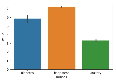
Barplot
Presenting categorical data by bar chart or bar graph.
sns.barplot(data=df1)
plt.gca().set(ylabel='Value', xlabel='Indices')

Stacked Barplot
import matplotlib.pyplot as plt
labels = ['A', 'B', 'C', 'D', 'E']
men_av = [23, 25, 33, 30, 18]
women_av = [15, 22, 30, 10, 15]
std_m = [1, 2.5, 3, 1, 1.5]
std_w = [2, 4, 1.5, 2, 2.5]
width = 0.5       # the width of the bars: can also be len(x) sequence

fig, ba = plt.subplots()

ba.bar(labels, men_av, width, yerr=std_m, label='Men')
ba.bar(labels, women_av, width, yerr=std_w,
       label='Women')

ba.set_ylabel('Scores')
ba.set_title('Scores by group and gender')
ba.legend()

plt.show()
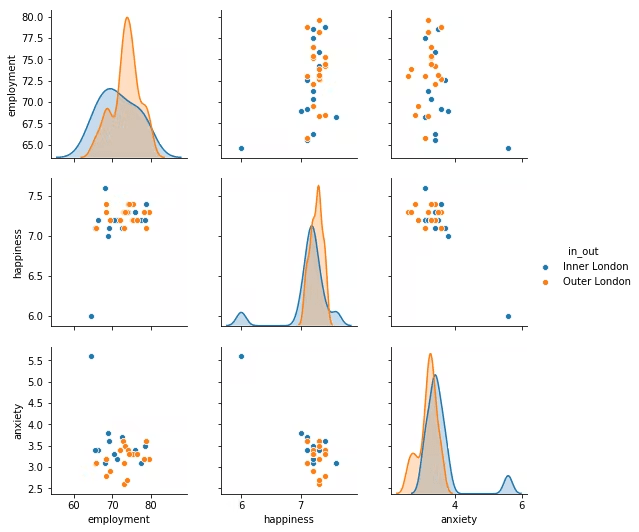
Pairplot
Pairplot used to presents the distribution of variables and relationships between variables.
sns.pairplot(data=df2, hue='in_out')
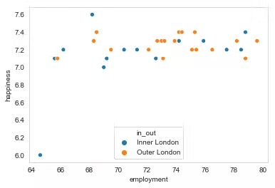
Scatterplot
Scatter plot shows the relationship between two variables.
sns.scatterplot(data=df2, x = 'employment',y= 'happiness', hue='in_out')
plt.legend(title="", loc=8)
3D Scatterplot
sns.set_style("whitegrid", {'axes.grid' : False})
fig = plt.figure()
ax = Axes3D(fig) # Method 1
#ax = fig.add_subplot(111, projection='3d') # Method 2
Create x, y, and z NumPy array data
X = np.array([0, 5, 10, 15, 20, 22, 26, 24, 14, 30])
Y = np.array([0, 3, 6, 9, 12, 22, 24, 26, 30, 20])
Z = np.array([3, 5, 11, 10, 12, 4, 5, 17, 10, 13])
Get colormap from seaborn
cmap = ListedColormap(sns.color_palette("husl", 256).as_hex())
g = ax.scatter(X, Y, Z, c=X, s= 50, marker='o', cmap = cmap, alpha = 1)
Set x, y and z labels
ax.set_xlabel('X Label')
ax.set_ylabel('Y Label')
ax.set_zlabel('Z Label')
Add a color bar which maps values to colors.
fig.colorbar( g, shrink=0.5, aspect=5)
plt.show()

Scatter plot with varying marker colors and sizes
Load data (^DJI stooq) from Pandas datareader
data = pdr.DataReader('^DJI', 'stooq')# Data of ^DJI stooq market
data
data = data[-365:] # get the most recent 365 days data
delta1 = np.diff(data.Close) / data.Close[:-1] # price of close day / price of close day before
volume = (15 * data.Volume[:-2] / data.Volume[0])**2
Set color for 363 days from seaborn (color palette) library
colors = sns.color_palette("Set3", 363)
Plotting to scatter plot:
fig, pl = plt.subplots()
pl.scatter(delta1[:-1], delta1[1:], color=colors, s=volume, alpha = 0.5)
Set x, y labels and title:
pl.set_xlabel(r'Δi', fontsize=12)
pl.set_ylabel(r'Δi+1', fontsize=12)
pl.xaxis.label.set_color('midnightblue')
pl.yaxis.label.set_color('midnightblue')
pl.set_title('Scatter plot of ^DJI stooq with volume and price change')
pl.grid(True)
Set x, y limittion
pl.axis([-0.025, 0.025, -0.025, 0.025]) # xlim , ylim
fig.tight_layout()
plt.show()

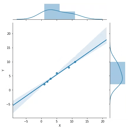
Jointplot
Besides shows the relationship between dependent variable(Y) and independent variable(X), it disples the distribution of X and Y.
# Linear regression
x = (1,3,5, 2, 9, 11)
y = (2,4,6, 3, 8, 10)
sns.jointplot (x=x, y=y, data =df , kind = "reg")
plt.gca().set(ylabel='Y', xlabel='X')
Piechart
# create data
names='A', 'B', 'C', 'D',
values=[5, 15, 30, 50]

# create a pieplot
plt.pie(values, labels = names, labeldistance=1.15, shadow=True, startangle=90, autopct='%1.1f%%')# Label distance: gives the space between labels and the center of the pie
plt.show()

Boxplot
df = pd.read_csv (r'D:\Python\Python_for_Researchers\sar_data.csv', encoding='unicode_escape')
df.head()

sns.boxplot(data=df,palette=["m", "g"])
sns.despine(offset=10, trim=True)
plt.gca().set(ylabel='Value', xlabel='Sensor')

Histogram
It represents the distribution of numerical data.
bio = [-2, 1, 2, 4, 2, 5, 5, 5,6 , 7, 9, 7, 5, 10, 15] # create data

sns.set_style('darkgrid') # set grid style
his = sns.distplot(bio)
his.set_xlabel('Value', fontsize=12) # set x label
his.set_ylabel('Frequency', fontsize=12) # set y label

Animated plot in Python
# read the data
data = pd.read_csv(r'd://myPub1.csv')
# Check the first 5 rows
data.head(5)

# And I need to transform my categorical column (continent) in a numerical value group1->1, group2->2...
data['Open']=pd.Categorical(data['Open'])

# For each year:
for i in data.Year.unique():

    # Turn interactive plotting off
    plt.ioff()

    # initialize a figure
    fig = plt.figure(figsize=(10, 6))

    # Find the subset of the dataset for the current year
    subsetData = data[ data.Year == i ]

    # Build the scatterplot
    plt.scatter(
        x=subsetData['Cum_Publications'],
        y=subsetData['Cum_Citations'],
        s=subsetData['Cum_Citations']*15,
        edgecolors="white", linewidth=2, color = 'midnightblue')

    # Add titles (main and on axis)
    plt.yscale('linear')
    plt.xlabel("Publication")
    plt.ylabel("Citation"),
    plt.title("Azad Rasul's Cumulative Publications and Citations during: "+str(i) )
    plt.ylim(-50, 500)
    plt.xlim(0, 25)

    # Save it & close the figure
    filename='/Users/Azad/Desktop/test/myPubCum'+str(i)+'.png'
    plt.savefig(fname=filename, dpi=96)
    plt.gca()
    plt.close(fig)
# conver to gif video online: https://gifmaker.me/
# After a list of png figures downloaded to your computer,
# you can convert them to gif video online, for example in this webste: https://gifmaker.me/

Animated scatterplot
# read the data (on the web)
data = pd.read_csv('https://raw.githubusercontent.com/holtzy/The-Python-Graph-Gallery/master/static/data/gapminderData.csv')

# Check the first 2 rows
data.head(10)


# And I need to transform my categorical column (continent) in a numerical value group1->1, group2->2...
data['continent']=pd.Categorical(data['continent'])

# Set the figure size
plt.figure(figsize=(10, 10))

# Subset of the data for year 1952
data1952 = data[ data.year == 1952 ]

# image resolution
dpi=96

# For each year:
for i in data.year.unique():

    # Turn interactive plotting off
    plt.ioff()

    # initialize a figure
    fig = plt.figure(figsize=(680/dpi, 480/dpi), dpi=dpi)

    # Find the subset of the dataset for the current year
    subsetData = data[ data.year == i ]

    # Build the scatterplot
    plt.scatter(
        x=subsetData['lifeExp'],
        y=subsetData['gdpPercap'],
        s=subsetData['pop']/200000 ,
        c=subsetData['continent'].cat.codes,
        cmap="Accent", alpha=0.6, edgecolors="white", linewidth=2)

    # Add titles (main and on axis)
    plt.yscale('log')
    plt.xlabel("Life Expectancy")
    plt.ylabel("GDP per Capita")
    plt.title("Year: "+str(i) )
#    plt.ylim(0,100000)
    plt.xlim(30, 90)

    # Save it & close the figure
    filename='/Users/Azad/Desktop/test/Gapminder_step'+str(i)+'.png'
    plt.savefig(fname=filename, dpi=96)
    plt.gca()
    plt.close(fig)
# conver to gif video online: https://gifmaker.me/

Categorical data (catplot)
If the variables are “categorical” (divided into discrete groups) it may be advantageous to use catplot. We can change the plot type by change: "kind" to violin, swarm, boxen, strip, box, point, bar or count.
Violin Catplot
Load titanic.csv file from load_dataset function in Seaborn library.
titanic = sns.load_dataset("titanic") # load titanic csv file from seaborn lab

g = sns.catplot(x='pclass', y="age",
                hue="alive",  # catigorize and change the color by alive column data
                data=titanic, kind='violin', legend_out=False) # legend_out = Faluse to move legend to inside the plot
plt.legend(title="Alive", loc=1) # Location: 'upper right':1

Swarm Catplot
titanic = sns.load_dataset("titanic") # load data

g = sns.catplot(x='pclass', y="age",
                hue="alive",
                data=titanic, kind='swarm', legend_out=False)
plt.axis([-1, 3, 0, 90]) # xlim , ylim
plt.legend(title="Alive", loc=9) # Location: 'upper center':9

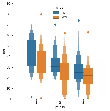
Boxen Catplot
titanic = sns.load_dataset("titanic")
g = sns.catplot(x='pclass', y="age",
                hue="alive",
                data=titanic, kind='boxen', legend_out = False)
plt.axis([-1, 3, 0, 90]) # xlim , ylim
plt.legend(title='Alive', loc = 9)
Strip Catplot
titanic = sns.load_dataset("titanic")
g = sns.catplot(x='pclass', y="age",
                hue="alive",
                data=titanic, kind='strip', legend_out=False)

plt.axis([-1, 3, 0, 90]) # xlim , ylim
plt.legend(title='Alive', loc = 9)

Box Catplot
titanic = sns.load_dataset("titanic")
g = sns.catplot(x='pclass', y="age",
                hue="alive",
                data=titanic, kind='box')

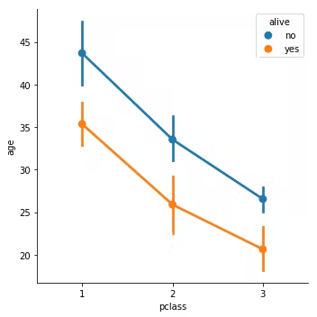
Point Catplot
titanic = sns.load_dataset("titanic")
g = sns.catplot(x='pclass', y="age",
                hue="alive",
                data=titanic, kind='point', legend_out = False)
Bar Catplot
titanic = sns.load_dataset("titanic")
g = sns.catplot(x='pclass', y="age",
                hue="alive",
                data=titanic, kind='bar', legend_out = False)

Count Catplot
sns.catplot( x='embark_town',
             kind="count",
             hue= "sex",
             data=titanic,
             height=5,
             aspect=1.5, legend_out = False)
plt.xlabel("Embark town", size=14)
plt.ylabel("Count", size=14)
#plt.tight_layout()
plt.legend(title="Gender", loc=9) # Location: 'upper center':9

If you like the content, please SUBSCRIBE to my channel for the future content.
To get full video tutorial and certificate, please, enroll in the course through this link: https://www.udemy.com/course/python-for-researchers/?referralCode=886CCF5C552567F1C4E7


Oldest comments (0)