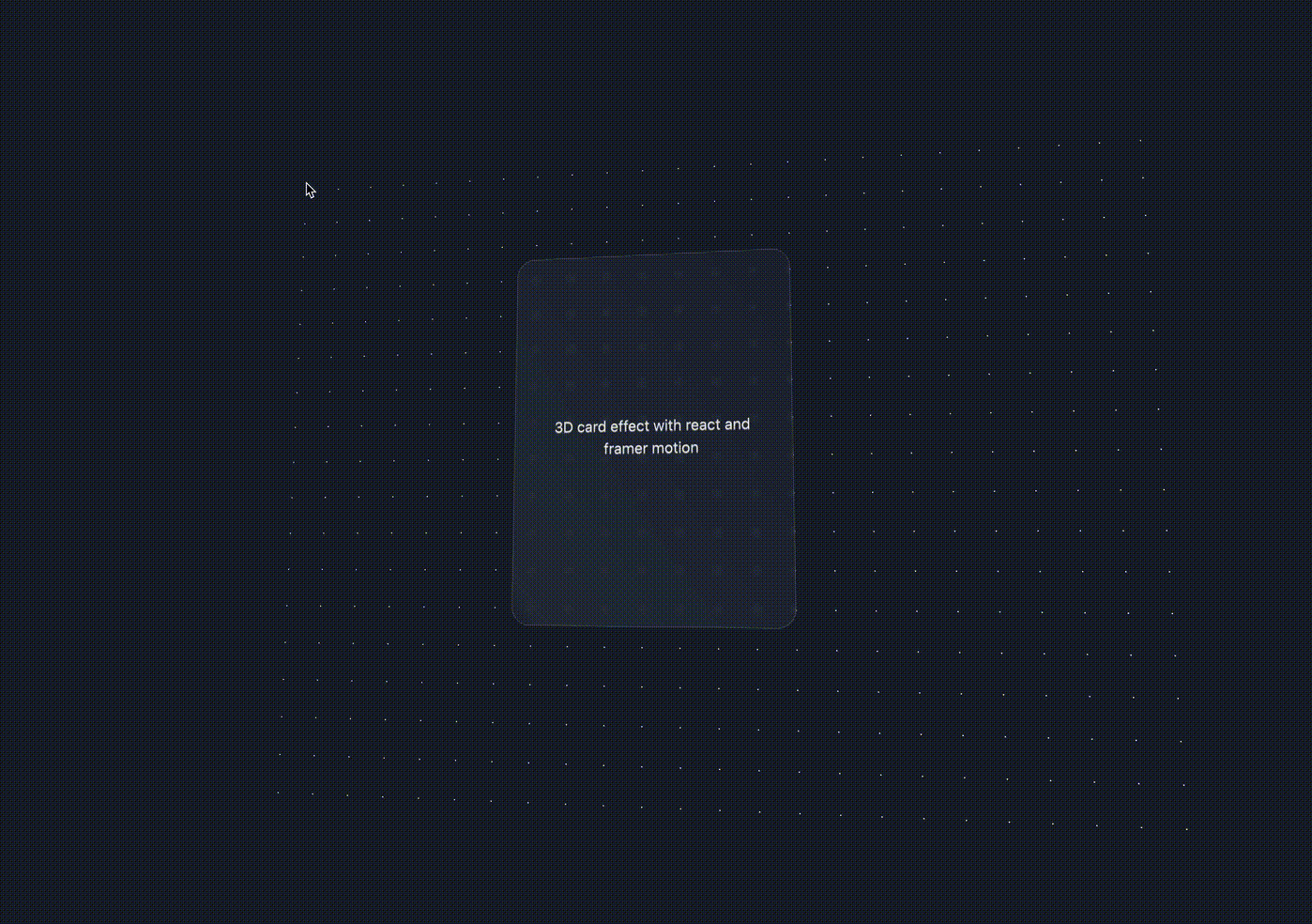
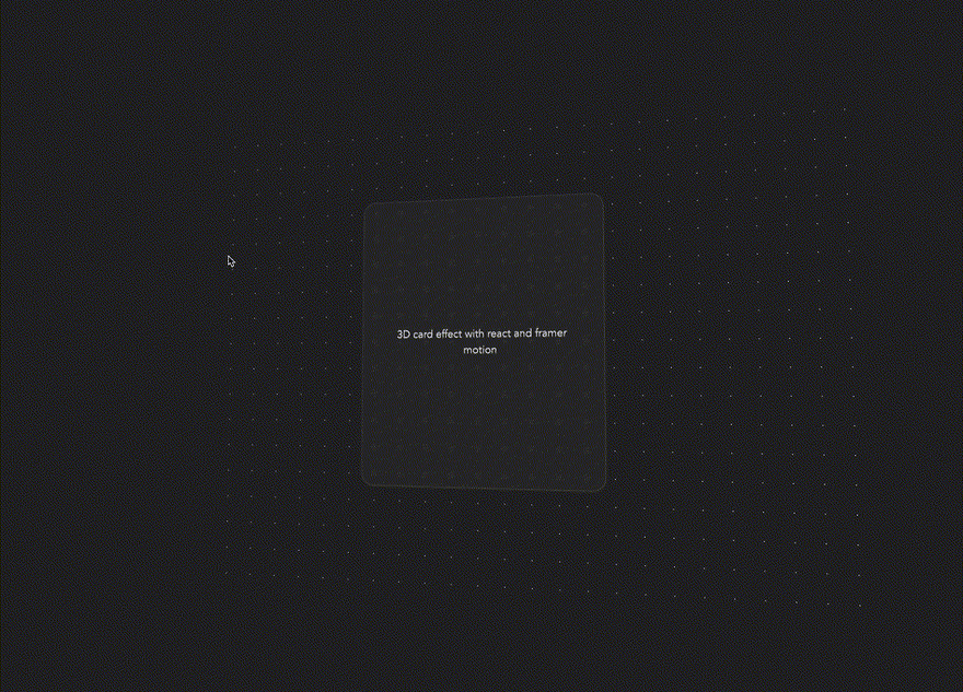
I noticed a 3D card animation on the Astro website that responds to mouse position, and it stuck in my mind.
I'd been meaning to update my portfolio website, and wanted something simple with social links and some novel effect.
I thought it would be a great opportunity to try out some animation techniques. You can see what I ended up with here. The background grid uses a technique outlined in my last tutorial.
In this tutorial we'll focus on a 3D animation that responds to mouse movement, creating a piece of glass that animates on a dotted grid background.
Check out the demo of what we'll be building here.
The tech we'll be using:
- React
- Vite
- TypeScript
- Emotion for CSS-in-JS
- Framer Motion
Setup
First off, we'll scaffold our project with Vite:
# npm
npm create vite@latest 3d-card-animation -- --template react-ts

# yarn
yarn create vite 3d-card-animation --template react-ts
And install the dependencies we'll need:
# npm
npm install @emotion/react @emotion/styled framer-motion

# yarn
yarn add @emotion/react @emotion/styled framer-motion
We'll use the default Vite styling for this tutorial, but we'll remove the light mode variant. Open up the index.css file and remove the following lines:
@media (prefers-color-scheme: light) {
  :root {
    color: #213547;
    background-color: #ffffff;
  }
  a:hover {
    color: #747bff;
  }
  button {
    background-color: #f9f9f9;
  }
}
Dotted grid
Inside of src, create a new components folder, and a DotGrid.tsx file inside of it. Add the following:
import styled from '@emotion/styled';

const SIZE = 60;

const DotGrid = styled.div`
  position: absolute;
  width: 100%;
  height: 100%;
  background-size: ${SIZE}px ${SIZE}px;
  background-image: radial-gradient(
    circle at 1px 1px,
    white 2px,
    transparent 0
  );
  background-position: center;
  transform: translateZ(-500px);
`;

export default DotGrid;
This will serve as the backdrop for our 3D card. The background- CSS properties are used to render our grid using the magic of a radial gradient. translateZ sends the element back on the z-axis, pushing the grid 'back' into the page.
We'll empty out our App.tsx file and replace it with the following:
import styled from '@emotion/styled';
import DotGrid from './components/DotGrid';

const Container = styled.div`
  position: relative;
  width: 100vw;
  height: 100vh;
  overflow: hidden;
  perspective: 1000px;
`;

function App() {
  return (
    <Container>
        <DotGrid />
    </Container>
  );
}

export default App;
We're setting the width and height to the viewport, and setting overflow to hidden so that when our animation goes off the page we don't end up with any scroll bars.
Card
Create a Card.tsx file inside of components with the following:
import styled from '@emotion/styled';

const Container = styled.div`
  width: 300px;
  height: 400px;
  border-radius: 20px;
  padding: 1rem 2rem;
  border: 1px solid rgba(200 200 200 / 0.2);
  display: flex;
  justify-content: center;
  align-items: center;
  text-align: center;
  color: #eee;
  text-shadow: 0 1px 0 #999;
`;

const Card: React.FC = () => {
  return <Container>3D card effect with react and framer motion</Container>;
};

export default Card;
Now, we're going to render this Card component and wrap our application. We'll be animating it with Framer Motion soon, so we'll make the wrapper a motion.div:
//...
import Card from './components/Card';
import { motion } from 'framer-motion';

const RotationWrapper = styled(motion.div)`
  width: 100%;
  height: 100%;
  display: flex;
  justify-content: center;
  align-items: center;
  transform-style: preserve-3d;
`;

// ...

<RotationWrapper>
    <DotGrid />
    <Card />
</RotationWrapper>

// ...
Our card should now be rendered in the middle of our dotted grid, but it's completely transparent. We want to give it a glass look.
The glass look
Usually we could apply a backgroundFilter style directly to our Card component, but that won't work here because of the transform-style property on our RotationWrapper. This property is necessary for the translateZ on our DotGrid. You can read more about it here.
To work around this, all we need to do is add a wrapper around Card and style that. We'll make it a motion.div so we can pass motion values to it later.
const CardWrapper = styled(motion.div)`
  border-radius: 20px;
  backdrop-filter: blur(3px) brightness(120%);
`;

// ...

<CardWrapper>
    <Card />
</CardWrapper>

Our elements are all set up — let's start animating them!
3D Rotate
We'll be continuing the rest of the tutorial directly inside the App.tsx file.
Track mouse movement
First, lets track mouse movement in relation to our card. Add the following to the App component:
// ...
import { animate, motion, useMotionValue } from 'framer-motion';
import { useEffect } from 'react';

// ...

// mouse position
const mouseX = useMotionValue(
    typeof window !== 'undefined' ? window.innerWidth / 2 : 0
);
const mouseY = useMotionValue(
    typeof window !== 'undefined' ? window.innerHeight / 2 : 0
);

// handle mouse move on document
useEffect(() => {
    const handleMouseMove = (e: MouseEvent) => {
        // animate mouse x and y
        animate(mouseX, e.clientX);
        animate(mouseY, e.clientY);
    };
    if (typeof window === 'undefined') return;
    // recalculate grid on resize
    window.addEventListener('mousemove', handleMouseMove);
    // cleanup
    return () => {
        window.removeEventListener('mousemove', handleMouseMove);
    };
}, []);
This adds an event listener when the component is mounted that will update motion values for the x and y position of the mouse.
Rotate elements
Now we need to translate our mouse coordinates into values to rotate our elements.
import { animate, motion, useMotionValue, useTransform } from 'framer-motion';
import { useEffect, useRef } from 'react';
// ...

const cardRef = useRef<HTMLDivElement>(null);

const dampen = 40;
const rotateX = useTransform<number, number>(mouseY, (newMouseY) => {
    if (!cardRef.current) return 0;
    const rect = cardRef.current.getBoundingClientRect();
    const newRotateX = newMouseY - rect.top - rect.height / 2;
    return -newRotateX / dampen;
});
const rotateY = useTransform(mouseX, (newMouseX) => {
    if (!cardRef.current) return 0;
    const rect = cardRef.current.getBoundingClientRect();
    const newRotateY = newMouseX - rect.left - rect.width / 2;
    return newRotateY / dampen;
});

// ...

return (
    <Container>
        <RotationWrapper style={{ rotateX, rotateY }}>
            <DotGrid />
            <CardWrapper ref={cardRef}>
                <Card />
            </CardWrapper>
        </RotationWrapper>
    </Container>
);
// ...
We pass a reference (cardRef) to the CardWrapper so that we can access its DOM element and determine our mouse position in relation to it.
Then, we use the Framer Motion useTransform hook to take our mouse position and translate it into values that represent the number of degrees to rotate on the x and y axis.
Adjusting the dampen variable will make this rotation more or less extreme.

Our card should now be rotating along with the background.
Add Polish
Let's add a sleek finishing touch to our 3D glass. We're going to do that by applying a light gradient over the card, and animating the position of that gradient.
Gradient sheen
Add the following to the App.tsx component:
// ...
import {
  animate,
  motion,
  useMotionTemplate,
  useMotionValue,
  useTransform,
} from 'framer-motion';

// ...

const diagonalMovement = useTransform<number, number>(
    [rotateX, rotateY],
    ([newRotateX, newRotateY]) => {
        const position: number = newRotateX + newRotateY;
        return position;
    }
);
const sheenPosition = useTransform(
    diagonalMovement,
    [-5, 5],
    [-100, 200]
);
const sheenGradient = useMotionTemplate`linear-gradient(55deg, transparent, rgba(255 255 255 / 1) ${sheenPosition}%, transparent)`;

// ...

<CardWrapper ref={cardRef} style={{ backgroundImage: sheenGradient }}>
First, we use a transform hook to take our existing rotateX and rotateY values, combine them, and return a single value called diagonalMovement.
We take a range from diagonalMovement of -5 and 5 and transform it into a new range. 50% should be our centre (our gradient would be through the middle of the card) with 150 above and below that.
We use the motion template hook to construct a template literal string that we can pass to our motion div as a background image property.

We have a pure white gradient running over our card. We'll need to lower the opacity, but notice how the gradient runs over the top right edge — it stops at the bottom right edge. The gradient position cannot go under 0%!
Sheen opacity
We'll make a couple of tweaks to fix our gradient issue:
  const sheenOpacity = useTransform(
    sheenPosition,
    [-100, 50, 200],
    [0, 0.05, 0]
  );
  const sheenGradient = useMotionTemplate`linear-gradient(
    55deg,
    transparent,
    rgba(255 255 255 / ${sheenOpacity}) ${sheenPosition}%,
    transparent)`;
We add another motion value, this time transforming the sheenPosition. We want the opacity to be 0 when the sheen is to the left or the right, and a maximum of 0.05 when it's in the centre. We pass this into the alpha portion of our gradient's RGBA value to control the opacity.
Well done — you've got a nice shiny 3D card you can fill with whatever content you want!
There's lots more you could do with this if you wanted to experiment.
Tweak some of the values and see what happens. To get a feel for the 3D side of things, I would suggest adjusting the perspective property on the Container element, translateZ on the DotGrid component, and the dampen variable that gets passed to our rotateX and rotateY motion values.
You can see the final code for this on the repo, which is built and deployed on the demo page.
Did you have any issues along the way? Maybe you took this effect in a whole new direction?
Let us know in the comments!


Oldest comments (4)
Hello,
I follow all the instruction but for some reason the mouvement for work only after i stop my mousemove. During my mousemove the card movement is extremely slow then when i stop mouving my mouse, the animation is working well.
If you have any idea.
Michael.
Hey!
i've made it work: codesandbox.io/s/framer-motion-rot...
Goodluck!
Hi,
the slow movement seems to be related to the version of framer-motion.
Downgrade it to e.g: "framer-motion": "^7.5.3", (the version used in the author's repo). This removed the slow movement in my test.
Have fun!
hi