Happy August, friends! How about an update to last week's post on the SwiftUI app for WriteFreely?
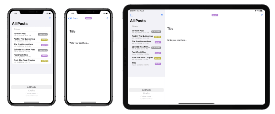
Work progressed pretty well on the shared code last week, to the point that we've got a preliminary UI that displays a list of posts, which you can filter by collection. Tapping on any post loads it into an editor, where you can make changes to the title and content.
On iPhone and iPad, there's also a new post button that will create a new draft. Why only on iPhone and iPad? Well, pull up a chair, and let's chat a little bit about the gap between the promise and the reality of multi-platform SwiftUI apps.
While I was working on the post, I tweeted that I managed to flesh out some of the key UI features for the app across iPhone, iPad, and Mac in a day, thanks to SwiftUI and live previews in Xcode 12, which show you what your views will look like next to your code, and update in realtime as you code.
I further stated:
This is building a native app with the speed of iteration that I've only ever encountered when building for the web.
(I'm looking at you, HTML and CSS. I am not looking at you, React.)
So here's what that latest iteration looks like so far, on iPhone and iPad:
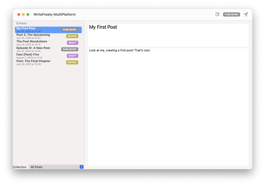
And, after I installed the macOS 11 (a.k.a. "Big Sur") beta, I was able to build the Mac app to compare:
This is in no way a final UI! There's plenty of work still to be done, including replacing the unusual "picker" view for selecting the Collection with a proper sidebar, and adapting the spacing a little better on the Mac app (you can't preview anything for a Mac target, even in Xcode, until you upgrade your own machine to the macOS 11 beta).
The DX of SwiftUI, as illustrated by ToolbarItemPlacement
One thing that's very helpful in moving quickly with SwiftUI is how its declarative nature lets you specify the semantics of an element's placement in your view, and letting the framework figure out what that should mean on iPhone vs iPad vs Mac. A great example of this focus on developer experience (DX) is the ToolbarItemPlacement API, which lets you semantically state that a particular item that you add to a toolbar is a .primaryAction, or a .status element, and so on.
This is used in the TextEditor view to place a post status badge in the .status area and a publish button in the .primaryAction area. You can see in the screenshots I shared above how these elements are placed differently depending on whether it's being shown on an iPhone, an iPad, or a Mac — and I didn't have to write a single line of code to customize the difference.
The Letdown of SwiftUI, as illustrated by broken buttons
But life in SwiftUI is not all roses. And that's where the new-draft feature isn't quite working fully, yet. Building the iPhone and iPad versions of the app, tapping the new-draft button above the list of posts works beautifully — it slides a new draft into the list, and then opens it in the text editor for your next great essay. I was thrilled to have this working by the end of my workday on Friday.
I finished installing the Big Sur beta on my Mac this morning, excited to see how everything looked and worked in the Mac app. I expected to have some little UI refinements (that list of posts, for example, needs a healthy dose of padding), but otherwise figured that it'd be a similar experience to, at the very least, the iPad app.
And mostly, it is. The picker is replaced by a popup menu, and you can choose a collection to narrow down the list of posts. You can tap a post in the list, and it'll load it in the text editor, ready for changes. If the post's status changes, it'll instantly update the badge both in the toolbar and in the post list.
And then I tried to create a new draft. On the Mac, clicking on that new-draft button (which appears, interestingly enough, next to the post-status badge in the screenshot) does… nothing. Not a thing. No errors are thrown, no views are drawn, nothing.
The Reality of Multiplatform
I suppose I shouldn't use the word letdown, because "multiplatform" is not a panacea: the reality is that an app expects different things between an iPhone, an iPad, and a Mac. The issue I'm facing with that new-draft button isn't some failing of SwiftUI; it's that the paradigm for how a Mac app treats navigation vs buttons vs instantiating new windows is very different from that of an iPhone, and I haven't structured things the way the framework expects.
So, fine. I'll need to spend a little more time on adapting the Mac client. I would have liked it if it all Just Worked™, but I've got to say: despite a couple of little issues that I need to fix, I'm really impressed with just how much of it worked right out of the box, with no extra work on my part.
Native-app development may not yet happen at the pace of web development, but it's closer than ever.


Top comments (0)