The Map
We bring this post to share what high-quality data can do for you. This time, we show you a sample dataset of real estate in Bilbao, Spain. All data comes directly from a ZenRows Task.
The content was collected from a well-known real estate website and plugged here with minimum effort. The original dataset contained some irrelevant fields for the demo, so we removed them for the sake of simplicity. Anyway, the map will ignore the additional fields. So you can use your dataset and make it work for you. You can find the working example and everything you need to play with it in this GitHub repository.
We cannot embed the map with functionality here, visit the original post to check it out
What the map represents
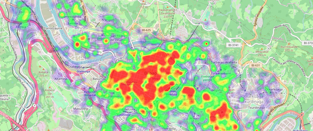
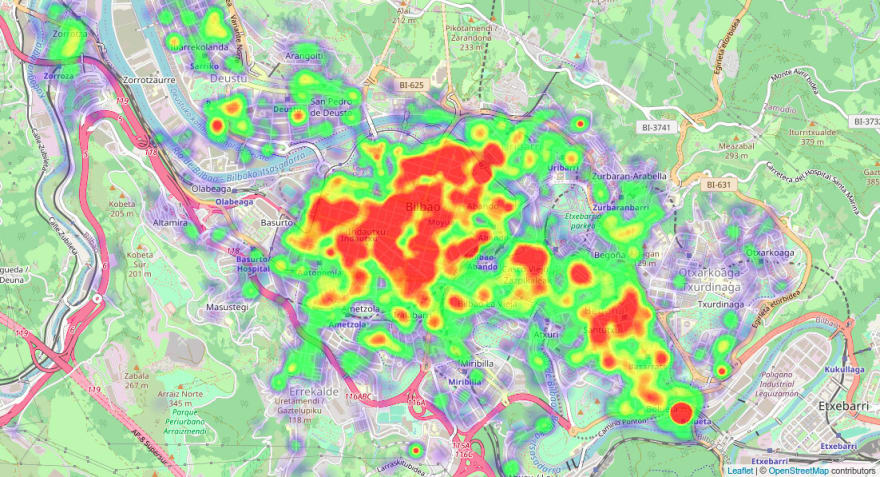
We took 3.000 houses on sale from Bilbao and plotted them on this map by geolocation. Without adding further info, that would be just a geographical representation. We could do that with map markers to show where houses are on sale.
But we decided to add some extra weight by adding data related to the pricing. Taking a look at several representations and real estate information, we chose heatmap by price per area (square meter in this case). That means that each listing will be a point on the map. Therefore, the higher the price per square meter, the redder it will be shown.
A small confession: we love experimenting. If you are interested in getting dataset samples for research - or fun - contact us.
Heatmap meaning
This mapping tool allows drawing attention to the areas with the highest price per square meter. Take into account this is an approximation, so don't blindly trust results. Consider it a representation, and therefore may not represent the whole picture.
Heatmaps are just one among many graph types. So it's convenient first to analyze your use case and the information available and then think about representing it best.
How we obtained the data
The essential part is data; the map is just a way to express graphically what that info represents. It can help experts point in the right direction or investigate further in some areas. But high-quality data is mandatory to take actions supported by facts.
In our case, the data proceeds directly from a well-known real estate website, and we obtained it using ZenRows Tasks. We identified the source, got the idea for this demo, and then easily created a Task to extract all the information. It collected almost 3.000 data points in under a minute.
Here are two snippets of the data: the first one comes directly from the task, and the second one is treated manually by us to reduce its size. The original one is incomplete for the same reason; we will publish an example dataset in the demo repository.
{
 "price": 475000,
 "formattedPrice": "475.000 €",
 "dateTimestamp": 1622565227557,
 "latitude": 43.25794,
 "longitude": -2.925409,
 "country": "España",
 "neighborhood": "Casco Viejo",
 "city": "Bilbao",
 "bathrooms": 2,
 "rooms": 5,
 "surface": 189,
 ...
}
{
 "latitude": 43.25794,
 "longitude": -2.925409,
 "pricePerArea": 2513
}
ZenRows tasks
The process is straightforward.
Choose a Name for the task, fill a set of URLs, and hit Run. That's all you need. Well, an idea or a hypothesis to validate would help, but that's on you ;)
We provide a simple process to obtain datasets, either one-time or recurring. In this case, we set a one-time task to collect a few thousand URLs since it didn't seem necessary to get the data over time. But if we, for instance, wanted to analyze how price evolves, a recurring task would be the ideal choice.
How can you effortlessly obtain the data you need
One of the most challenging parts is obtaining data and then turning it in a structured way with some automation. And later extract the insights. So the process is not easy after all. The good news is, we can help you there.
We encourage you to do some research beforehand to identify trustworthy data sources that fill your needs. Only then start the automation process.
What use cases does this have
Some other cases for real estate
Following the example with real estate, we could change the data to highlight the largest houses or the most expensive ones. And for agencies or investors, plotting some of the data and looking for outliers or opportunities can help extract some good insights.
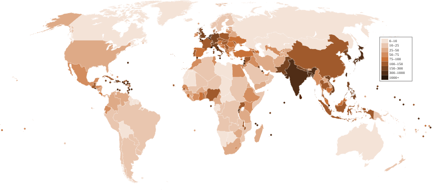
Population density
Lately, there has been a lot of talk about internal migrations and if population density will change due to remote work. That is a great use case for heatmaps, primarily if you use a map with state shapes or equivalent in your area.
Here is an example of population density (people per km2) by country, credit to Wikipedia.
Mean salaries
Not much to add here, this is an ongoing discussion forever, and we will not settle it down. But we can at least shed some light. As with the previous point, maps with shapes can help to understand the data thoroughly. In this case, municipalities even better than states.Common flight origin and destinations
We all know the big, known airports in our area, but maybe there are many outliers that we ignore. We can plot all that info in a heatmap or a flow chart. If you are, for some reason, planning on opening a new airport, you could include the population density on the map to find the best match. Not a typical case, I'd say.Stores and potential markets
Maybe this is a better use case for the previous example. Think of any chain store that is looking for a new place. You could set markers for the existing one and a heatmap with the population. Or even better, add weight to your customer type - mid-aged females, for example.Drought control
With a direct application in farming, early detection of droughts is paramount. We are not meteorologists, but we can turn temperature and raining data points into maps and then help the experts interpret the raw data.Restaurant density or pricing
We could draw something very similar effortlessly by replacing the price per square meter with the restaurant price. You can try it out using a small repository that we created for this demo and get the data from Yelp or Tripadvisor.
Conclusion
A geographical heatmap is just one of the multiple ways of representing data. We need an accurate source of information, an automated way of extracting structured data from there, and a process for shedding some light into insights.
Our hassle-free process will help you quickly get the data you need. So check our content for inspiration in data sources and representations. And, of course, contact us and try ZenRows for free to start automatizing in a minute.
Previously published at https://www.zenrows.com/blog/collecting-data-to-map-housing-prices


Top comments (0)