
This article was originally published in freeCodeCamp.
A few weeks ago I decided I should admit to all the things I’ve never understood about basic CSS. I would try to do a deep and conscious dive into them and finally get them. It seemed that now, more than a couple years after learning about CSS for the first time, I could use all the experience I’ve gathered to my advantage. This time it should be easier and clearer.
In August, I kicked it off with an intro to the mysterious pairings of the position property. Here’s my second stop in the journey:
The float property, in the form of cooking recipes.
Recipes Index
- Sushi rows — make elements cover a full row in an even manner
- Clearing broth — make content found below the floats act normally
Sushi rows 🥢
We'll use floats and percentage values to distribute elements evenly in the full (container) width. Just like sushi rows in a plate.
Ingredients:
- 1 container or board
- Some sushi pieces you need to distribute side-by-side.
- The % sign
- 1 float: left;
Instructions:
Prepare your sushi pieces, that is, the elements you want to be displayed in a row. They could be makis, item cards, nigiris, icons, whatever suits your taste.
You can also add any non-positioning styling to them: colors, text-alignment, fonts or soy sauce.
Put them inside a block container, like a board. In its most basic form, this should be a div (but you can use any other HTML5 semantic elements such as header, footer, section, article, main). Add a descriptive class for them. I’ll be using nigiri.
<html>
  <body>
    <div class="board">
        <div class="nigiri">
          <h1>/ / / / /</h1>
        </div>
        <div class="nigiri">
          <h1>/ / / / /</h1>
        </div>
        <div class="nigiri">
          <h1>/ / / / /</h1>
        </div>
    </div>
  </body>
</html>

<!-- Don't mind the `/`s, they're for the salmon's stripy effect. -->
Now, on class nigiri we'll apply some styles, including our float: left;. Take a moment and read through them:
.nigiri {
  margin: 0 10px;  /* fixed 10px margin and padding... for now! */
  padding: 0 10px;
  float: left;

/*  Extra things to makit look nice  */
  background-color: #fff;
  border-radius: 100px;
  box-shadow: inset -3px -6px 0 0 #ece0cd;
}

.nigiri > h1 {
  background-color: #fca35d;
  color: #fce2da;
  border-radius: 100px;
  font-weight: 100;
}

.board {
  width: 500px;
  height: 200px; /* we need this because floated elements don't occupy real Document Flow space, try removing it! */
  margin: 20px auto;
  padding: 10px;
  background: #CBAD8C;
  border-radius: 8px;
  box-shadow: 12px 8px 0 rgba(#000, 0.1);
}
What float: left; does is tell every element to stick to one side — in this case, left — and stand next to each other in a left-to-right row.
Note that we're adding height to the board. Normally we wouldn’t need this: the board would expand to fit whatever is in it. But floating elements, like our nigiris, are different: they don’t occupy real Document space and don’t affect other, non-floating elements. That’s why we’re using a fixed, pixel-sized height for the board.
Now, you should see all your elements on a single row. But something’s not quite right. They’re all piling up on the left and you probably have a lot of empty space on the right side of your board.
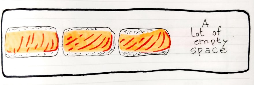
We need to space them evenly.
We can do that by setting the nigiri's width to be relative to their container (the board in this case) using a percentage value. But, for 3 elements, is it just 33.33%? Well, it's not that simple...
Now this is the tricky part: the % you need to set will depend on 3 things
- how many items you have
- how they’re structured inwardly (padding)
- and how much space you want between them.
Do you want them to stick to each other side by side or do they need some margin in between them? If the sushi pieces have rice padding, that will cause them to be bigger than their content. You’ll have to compensate that by decreasing their width. For this reason, it’s also advisable to use % in the padding values.
I know al this can be confusing. Here’s a handmade single-press illustration that I hope can... well, illustrate it clearly.
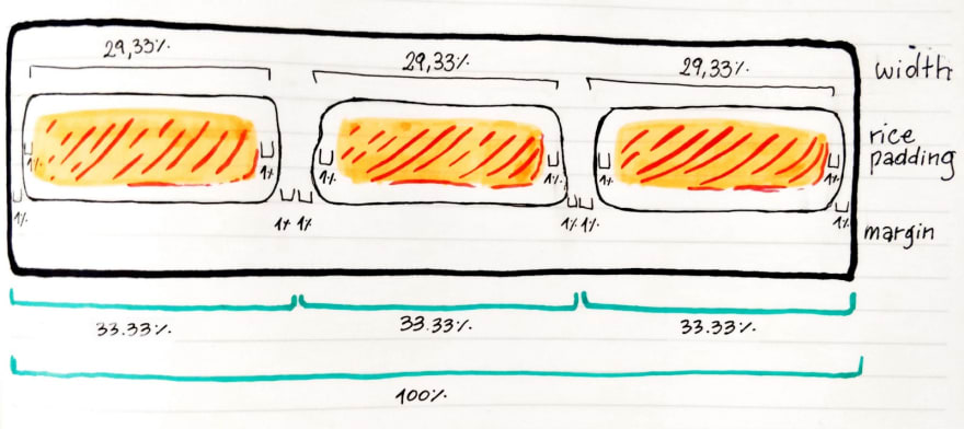
Each nigiri is 33.33% of the board’s full width:
- 2% for margin on each side,
- 2% for padding on each side
- and then 29.33% of their actual width.
But this is a recipe, not a math lesson. To make it easier for you, dear readers, here are some common combinations for shoulder-to-shoulder and margin-spaced elements, all with 1% rice padding:
/* Two elements in the row */

.two.shoulder {
  width: 48%;
  padding: 1%;
}

.two.spaced {
  width: 46%;
  padding: 1%;
  margin: 1%;
}


/* Three elements in the row */

.three.shoulder {
  width: 31.33%;
  padding: 1%;
}

.three.spaced {
  width: 29.33%;
  padding: 1%;
  margin: 1%;
}


/* Four elements in the row */

.four.shoulder {
  width: 23%;
  padding: 1%;
}

.four.spaced {
  width: 21%;
  padding: 1%;
  margin: 1%;
}


/* Five elements in the row */

.five.shoulder {
  width: 18%;
  padding: 1%;
}

.five.spaced {
  width: 16%;
  padding: 1%;
  margin: 1%;
}
Feel free to take as many as you want.
You may have noticed the pattern here: we’re assuming elements come with 1% of padding. They need to compensate that by subtracting 2% (1% for each side) from the element’s percentage width. Same goes for our 1% margin breather. Now it makes more sense to not use 33.33% width for 3 elements in a row. Instead set it to 29.33% after leaving 2% the padding and 2% for the margin on each.
Sigh… that was a lot of math. Ok so now, no matter how many pieces your sushi roll gets chopped in, you know how to present them nicely in a board.
If you want to play around with this setup, here's a CodePen specially made for that.
And if you like CSS sushi, don't miss Sasha Tran's very inspiring CSS Sushi Board.
Clearing broth 🍲
The perfect soup to have with some floating sushi, while making sure your portions don’t end up swimming in it.
Ingredients:
- One container or board with floating sushi
- A soup or broth to follow after it.
- One clear: broth;
Instructions:
Once you have your row of floating sushi pieces ready, place your soup container below them in the html.
Our sushi is meant to gracefully float "above" the Document flow and not affect other elements. If we’re not careful they might just end up floating in soup and sushi-ramen is not something the world is ready for.
Remember that floating elements don’t have real Document height. This also means that they don’t “push” the soup down. Now look at this horrific mess:
To prevent this atrocity, we need to add our clear: broth;… I mean both;!
We have two options here:
We can simply put the soup in a bowl or container and give the bowl a style of clear: both;. This will sort of get the job done, but it will result in things like margin-top not working at all on the bowl.
So if we want the sushi pieces to be completely protected from soup flooding — and not lose any features in the way — we need them to be contained in a plate with a high edge. To achieve that we’ll add an :after pseudo-element to the sushi plate (that is, the container of our little nigiri floaters):
.nigiri-plate {
  background-color: #223;
  box-shadow: inset -8px -8px 0 0 #558;
  border-radius: 20px;
  height: 105px;
}

.nigiri-plate:after {
  content: "";
  clear: both;
  display: block;
}
The pseudo-element needs an empty content to even exist. Then "clear:both" and "display:block" are there for the purposes of this technique.
Below there's another example for you play around with. I’ve made the plate visible using height and background color. Even though that’s not necessary for the soup to be well placed, it just makes it look fancier 🎩
I've also front-and-centered the soup bowl with the classic margin: anything, auto; technique.
Think of this strategy as making the sushi dish have a very high southern wall in order to prevent any soup from flooding in. But… like… a nice wall.
All right, I’m super glad that you made it this far and I hope this tiny recipe book helped you get a better idea on how floats work… and how we can work with floats. Stay tuned for more deep-dive-into-basic-but-elusive-things like this 😉


Latest comments (7)
Nice article! It is very important to deeply understand what the different CSS properties are for, thanks for sharing it!! However I think it must be pointed out that Floats are not for layout.
CSS float MDN
For that purpose we have CSS Flexbox and CSS Grid now. Floats are bad for layout purposes, but are great for what they are meant to, and I quote this blog post:
Floats are Bad! Wait, they aren’t?
They are great for text and content formatting, Jen Simmons explain this very well and put's in an extremely good example of how floats are great for things like CSS Shapes in this video.
Obliterate Boxiness with CSS Shapes
And implicitly shows a great example of this at the 0:30s mark.
I really recommend everyone to watch her videos, they are very good at explaining several concepts.
Thanks, always get irritated when I have to touch css. Was a nice read👍🏼
A great way to handle the messiness of evenly spacing divs that you want aligned in a row like this is to use CSS Flexbox. It is amazing. I was introduced to it from here: css-tricks.com/snippets/css/a-guid...
I recently started learning some CSS and came across Grid as well. It's kinda like flexbox but with 2 dimensions. So you can specify locations in your layout by just assigning a row / column to it.
Yeah grid is great too! When I start having too many flexbox container divs I typically switch over to using grid. The only problem is if you are worried about browser support, IE doesn't support it. 😔
I actually listened to a talk recently and found out Grid was made for IE (Edge), however other browsers took it and improved on it. So IE is lagging behind. It does support it, however not all functions. There's a check you can do to see what commands are supported. Check out this talkfrom 2017.
Hi, don’t miss inline-start and inline-end as float value.