
As you probably know by now, last September Evan You announced the new version of Vue (Vue 3.0 or "One Piece" for friends) during the Vue.js Global Event - Official release here.
The hype for upgrading code to the latest version of Vue exploded and everyone (including me) was eager to start. But they are breaking changes, especially on the global API, forcing library/plugin authors to migrate their code to support the new version and the Composition API. If you want to understand better why I wrote an article on how to do the migration from 2.x to 3.x here - How to migrate your library from Vue 2.x to Vue 3.x
As an author of a Vue library, I have to say that the migration wasn't an easy job, imitating what major libraries did: separating the support for each the targeting version in separate branches and tags (main for vue 2.x and next for vue 3.x) or even having a separate repo to ensure better code isolation.
As Vue.js core member @antfu (Anthony Fu) explains in this post:
The drawback of this is that you will need to maintain two codebases that double your workload. For small scale libraries or new libraries that want to support both versions, doing bugfix or feature supplements twice is just no ideal. I would not recommend using this approach at the very beginning of your projects.
It's possible to achieve this by using a developing tool that the same @antfu created called Vue-demi.
So if you are interested to learn how to create a universal library/plugin for both versions of Vue, this article is for you.
Create base setup
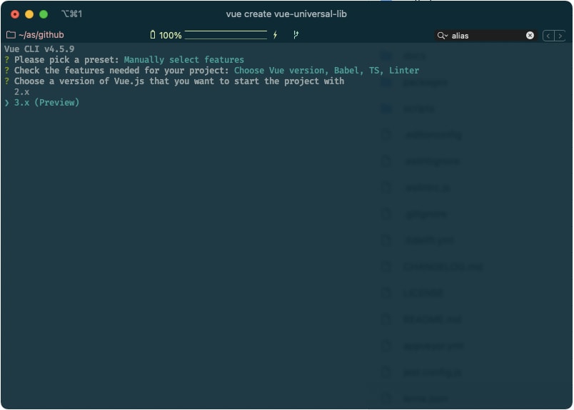
Let's begin by creating a new project using vue-cli prompt.
vue create vue-universal-lib
Be sure you select the 3.x version for Vue, and the rest I leave it to your preferences, but I strongly suggest you use the same options as I describe here to be on the same page:
Options selected:
- Babel
- Typescript
- Linter
- Use class-style component syntax No
- Use Babel alongside TypeScript Yes
- Pick a linter: ESLint + Prettier
After some seconds we will have a basic structure to start with. You probably need to get rid of some stuff like the App.vue and main.ts since we mainly are going to work with an index.ts file.
Find a purpose
Sounds epic right? Fun apart find a necessity, some functionality often used in Web development that you want to implement in Vue and make it reusable, something that you think will bring value being a library/plugin.

For this tutorial sake, we will create a simple library that allows you to animate numbers like a counter, similar to this:
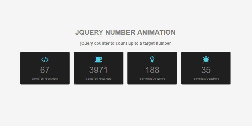
This type of component is often used in landing pages to show KPIs.
Hands dirty
First of all, let's create the counter-number component under src/components/CounterNumber.ts using defineComponent.
import { ref, defineComponent, h } from 'vue';

export const CounterNumber = defineComponent({
  name: 'Awesome',
  props,
  setup(props, ctx) {
    const value = ref(640);

    return () =>
      h(
        'span',
        {
          class: 'counter-number',
        },
        value,
      );
  },
});
For the moment let's leave it as a presentational component without the animation, later we will add the functionality through a composable function to take advantage of Vue3's Composition API.
You might also notice there is no template for the component in here, the setup function returns a render function with a <span> element holding the counter value. That's intended and will be explained in the Caveates section of the post.
For demo purposes leave out a main.ts and the App.vue to test the new component using npm serve.
Plugin installation
For creating the plugin itself create a src/index.ts:
import { App, inject, InjectionKey } from 'vue';
import { CounterNumber } from './components/CounterNumber';

export interface VueCounterOptions {
  theme: string;
}

export interface VueCounterPlugin {
  options?: VueCounterOptions;
  install(app: App): void;
}

export const VueCounterPluginSymbol: InjectionKey<VueCounterPlugin> = Symbol();

export function VueCounterPlugin(): VueCounterPlugin {
  const VueCounterPlugin = inject(VueCounterPluginSymbol);
  if (!VueCounterPlugin) throw new Error('No VueCounterPlugin provided!!!');

  return VueCounterPlugin;
}

export function createVueCounterPlugin(
  options?: VueCounterOptions,
): VueCounterPlugin {
  const plugin: VueCounterPlugin = {
    options,
    install(app: App) {
      app.component('vue-counter', CounterNumber);
      app.provide(VueCounterPluginSymbol, this);
    },
  };

  return plugin;
}
Let's break this down into parts, the function createVueCounterPlugin will allow you to install the plugin via the install method when using createApp.use() in your app.
This will add to the app instance all the components, properties of your library like you see above with app.component('vue-counter', CounterNumber);
To get most of the Composition API and be able to inject into your library components things like options or utilities we create a Plugin Symbol to be used along with app.provide in the install method where we pass the createVueCounterPlugin itself as a parameter. This might look complicated at the moment, but it's the standard way:
// index.ts

...
export const VueCounterPluginSymbol: InjectionKey<VueCounterPlugin> = Symbol();

export function VueCounterPlugin(): VueCounterPlugin {
  const VueCounterPlugin = inject(VueCounterPluginSymbol);
  if (!VueCounterPlugin) throw new Error('No VueCounterPlugin provided!!!');

  return VueCounterPlugin;
}

...
To install the plugin and test it, go to your src/main.ts:
import { createApp } from 'vue';
import App from './App.vue';
import './assets/styles/main.css';

import { createVueCounterPlugin } from './';

const VueCounterPlugin = createVueCounterPlugin();

createApp(App).use(VueCounterPlugin).mount('#app');
If you like to pass options to your plugin you can do it like this
const VueCounterPlugin = createVueCounterPlugin({ theme: 'light' });
The magic behind what we did is that using app.provide in the plugin install method is that we can inject the plugin options as a dependency later.
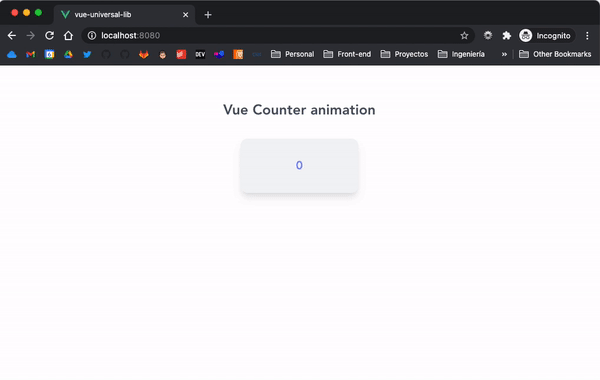
Now let's add the CounterNumber component into the src/App.vue.
// App.vue

<template>
  <h2 class="font-bold text-2xl mb-8 text-gray-600">
    Vue Counter animation
  </h2>
  <div
    class="card bg-gray-100 rounded-xl p-8 auto shadow-lg mx-auto w-1/3 text-indigo-400 font-bold text-xl"
  >
    <vue-counter />
  </div>
</template>

<script lang="ts">
import { defineComponent, ref } from 'vue';

export default defineComponent({
  name: 'App',
});
</script>
If you are curious about the utility classes I used here, is the awesome TailwindCSS which I love for doing quick prototypes. You can install it also by following this guide. Just make sure you add those dependencies as devDependencies to your package.json or they will be included in your library bundle.
Let's see how it looks on the browser with npm run serve

Animation and composition
Looks beautiful, but needs more magic. Let's add the easing animation for the counter. To achieve a smooth animation, we will be using a library called anime.js, which is really lightweight and offers and plain simple API.
We could add the logic directly on the CounterNumber component, but since we talked before about Composition API let's use it for this purpose.
Create a useCounter.ts file under src/composables and export a function called useCounter like this:
import { ref } from 'vue';

import anime from 'animejs/lib/anime.es.js';

export function useCounter() {
  const count = ref(0);
  const counter = {
    value: 0,
  };

  anime({
    targets: counter,
    duration: 2000, // 2000ms
    value: 640,
    easing: 'easeOutQuad',
    update: () => {
      count.value = Math.round(counter.value);
    },
  });

  return {
    count,
  };
}
We import a factory function called 'anime' from 'animejs/lib/anime.es.js' and we pass a target (in this case an obj containing a ref with the value to be animated).
The anime() function accepts a lot of parameters to customize the behavior of the animation such as duration, delay, easing, and callbacks like an update that triggers every time the animation updates the target object. The interesting thing is that you can pass as property the same property you want to animate, in this case value, in the example above will go from 0 to 640. For more info about the animejs API check the docs
Go back to your CounterNumber.ts component and get the use the count.value inside the span like this:
export const CounterNumber = defineComponent({
  name: 'Awesome',
  props,
  setup(props, ctx) {
    const { count } = useCounter();

    return () =>
      h(
        'span',
        {
          class: 'counter-number',
        },
        count.value,
      );
  },
});
Now go back to the browser and refresh to see how the counter goes from 0 to 640 in 2 seconds.
Make it customizable
At the moment, all values are hardcoded, but since we are doing a library, these parameters for the animation should be customizable and therefore passed as props to the component and down to the composition function.
First, let's add some props that make sense:
// src/components/Counternumber

const props = {
  from: {
    type: [Number, String],
    default: 0,
  },
  to: {
    type: [Number, String],
    required: true,
    default: 0,
  },
  duration: {
    type: Number,
    default: 1000, // Duration of animation in ms
  },
  easing: {
    type: String,
    default: 'easeInOutQuad',
  },
  delay: {
    type: Number,
    default: 0, // Delay the animation in ms
  },
};

export const CounterNumber = defineComponent({
  name: 'Awesome',
  props,
  setup(props, ctx) {
    const { count } = useCounter(props);
...
  },
});
Make sure you pass the props to the useCounter(props) function;
Go to App.vue and create some variables to pass to the component as props:
<template>
  <h2 class="font-bold text-2xl mb-8 text-gray-600">Vue Counter animation</h2>
  <div
    class="card bg-gray-100 rounded-xl p-8 auto shadow-lg mx-auto w-1/3 text-indigo-400 font-bold text-xl"
  >
    <vue-counter :from="0" :to="640" :duration="3000" :delay="2000" />
  </div>
</template>

<script lang="ts">
import { defineComponent, ref } from 'vue';

export default defineComponent({
  name: 'App',,
});
</script>
Finally, go back to useCounter.ts and pass the props to the anime instance
import { ref } from 'vue';

import anime from 'animejs/lib/anime.es.js';

export function useCounter(props: any, emit: any) {
  const count = ref(0);
  const counter = {
    value: props.from,
  };

  anime({
    targets: counter,
    duration: props.duration,
    value: props.to,
    delay: props.delay,
    easing: props.easing || 'linear',
    update: () => {
      count.value = Math.round(counter.value);
    },
  });

  return {
    count,
  };
}
Of course, we would need to add more code to make it create a new instance of the anime object every time a prop change, but for the scope of the article is more than enough.
Make it universal
So great, we have our awesome library ready, at the moment, is only usable on a project with for Vue 3, how can we achieve an isomorphic installation?
That's where vue-demi comes to the rescue.
npm i vue-demi
# or
yarn add vue-demi
Add vue and @vue/composition-api to your plugin's peer dependencies to specify what versions you support.
// package.json

{
  "dependencies": {
    "vue-demi": "latest"
  },
  "peerDependencies": {
    "@vue/composition-api": "^1.0.0-beta.12",
    "vue": "^2.6.11 || >=3.0.5"
  }
}
Now comes the important part 📝, to take notes on it: replace all the imports coming from vue to vue-demi, like so:
import { defineComponent, ref } from 'vue';
Will become:
import { defineComponent, ref } from 'vue-demi';
The library will redirect to vue@2 + @vue/composition-api or vue@3 based on users' environments.
That's powerful.
Build config
You can build your plugin bundle in so many different ways, webpack, vue-cli (webpack also), parser, rollup, etc. It's up to you, but I really recommend using rollup.js, is a great module bundler, really easy to get into, and is used in most of the major Vue plugins out there, such as Vue Router.
yarn add rollup rollup-plugin-vue rollup-plugin-typescript2 rollup-plugin-terser @rollup/plugin-node-resolve @rollup/plugin-commonjs @rollup/plugin-replace -D
Also, we will need to tweak a little bit the configuration so it externalizes vue-demi instead of vue and set it as a global at the build moment. Because the rollup.config.js is quite large, here is the link to it at the example repo.
In the method createConfig make sure you have vue-demi set in the property globals like this:
// rollup.config.js
...
output.globals = { 'vue-demi': 'VueDemi' };
...
const external = ['vue-demi'];
Finally, let's add a script in the package.json and the paths for the package builds:
// package.json

"scripts": {
  "build": "rollup -c rollup.config.js",

}
"main": "dist/vue-universal-lib.cjs.js",
"browser": "dist/vue-universal-lib.esm.js",
"unpkg": "dist/vue-universal-lib.global.js",
"jsdelivr": "dist/vue-universal-lib.global.js",
"module": "dist/vue-universal-lib.esm-bundler.js",
"types": "dist/vue-universal-lib.d.ts",
Caveats
Of course, is not all roses 🌹 and unicorns 🦄, the use case of vue-demi is rather for vue plugins that don't rely too much on rendering components because Vue 2 and Vue 3 render functions are quite different and the breaking changes between both, i.e. v-model on a component expecting differently named events in Vue 2 vs 3 (ìnput vs update:modelValue).
That's why we used a render function for our component definition and a .ts file instead of a .vue file. For this example library, it will not affect the end result but it's something you need to take into consideration.
One way to possibly adapt breaking changes in your lib component would be the use of extra APIs from Vue Demi to help distinguishing users' environments and to do some version-specific logic.
isVue2 isVue3
import { isVue2, isVue3 } from 'vue-demi';

if (isVue2) {
  // Vue 2 only
} else {
  // Vue 3 only
}
That being said I hope this article was illustrative enough on the journey of creating a universal plugin for Vue. Let me hear your thoughts and questions below.
Happy coding! 😎


Top comments (2)
The components must be render functions ?
.