FURNITURE LANDING PAGE
Hello there,
Allison is here with another project!!💃🏽 . I think I just might be getting the hang of this writing business and I am loving every minute of it. Firstly, I don't think I've revealed much about myself, so let me start with what I do. I work for a film distribution company, so apparently I watch movies for a living 😌 while on the side learning Front-end development so I can later change careers or do both, but I doubt that will happen. My first step into the tech world has been overwhelming, but they say nothing good comes easy, so here I am doing my best to stay in the game.
.
I'm currently working on my third project using CSS flexbox. I honestly thought CSS would be easy since HTML was, but then I realized it's not just about 'beautification' but also responsiveness...WHEEW ...I wasn't prepared for Flex Box. While surfing the internet, I came across an article about an effective way to learn Flexbox
A BRIEF SUMMARY ON FLEX-BOX
The Flexible Box Layout Model (flexbox) is a layout model designed for one-dimensional content. It excels at taking a bunch of items which have different sizes, and returning the best layout for those items.
Flex layouts have the following features, which you will be able to explore in this guide.
They can display as a row, or a column.
They respect the writing mode of the document.
They are single line by default, but can be asked to wrap onto multiple lines.
Items in the layout can be visually reordered, away from their order in the DOM.
Space can be distributed inside the items, so they become bigger and smaller according to the space available in their parent.
Space can be distributed around the items and flex lines in a wrapped layout, using the Box Alignment properties.
The items themselves can be aligned on the cross axis.
FLEX-BOX ALLIGNMENT OVERVIEW
Flexbox brought with it a set of properties for aligning items and distributing space between items. These properties were so useful they have since been moved into their own specification, you'll encounter them in Grid Layout too. Here you can find out how they work when you are using flexbox.
The set of properties can be placed into two groups. Properties for space distribution, and properties for alignment. The properties which distribute space are:
justify-content: space distribution on the main axis.
align-content: space distribution on the cross axis.
place-content: a shorthand for setting both of the above properties.
The properties used for alignment in flex box:
align-self: aligns a single item on the cross axis
align-items: aligns all of the items as a group on the cross axis
https://web.dev/learn/css/flexbox/
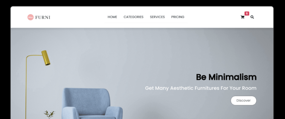
I decided to try out the flex box knowledge with this minimalist one page site I found on Dribble and use it to experiment the knowledge I had acquired about them.
i started off with the navigation bar, and since i have done so many navbar, i picked one from one of my collections. i had a hard time organizing it and making it responsive, but with a few tutorials especially one from Kevin Powell, I managed to make it responsive.
https://www.youtube.com/watch?v=fm3dSg4cxRI&t=38s
Additionally, I have learned you should do more projects to improve your skills and there are many different paths you can take in web development. Here’s the finished product https://furni-landing-page.vercel.app/ the links in the navbar don’t go anywhere for now since it’s a demo page . When I've mastered more knowledge, I'll build an e-commerce site.
Sincerely, if you read to the end, thank you
All done folks, have a great day!
Kisses until next time😘.


Top comments (1)
Great post keep it up 👍😌