Nowadays, it's hard to get your first job without impressing somebody with your portfolio. Everybody is creating weather apps, but does everybody have custom CSS-based images in theirs? Let's create unique images to boost your portfolio.
There are multiple shapes that we can create in CSS, so why not create custom CSS images instead of stock photos? These will cut some unnecessary requests and speed up your website; moreover, they allow you to bring some life to your site.
I don't want to create the entire app here, only images that you can use to build one. It may look like you put in a lot of effort to tweak the app, but you didn't.
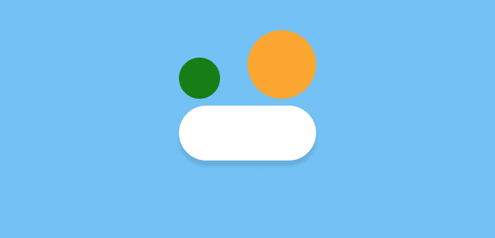
Exercise 1. First-Ever CSS Cloud
Let's start with a simple cloud. This cloud is made with one rectangle and two circles. You can use three divs, but I prefer to minimalize HTML as much as I can. That's why I use one div for the rectangle and two pseudo-elements to create the circles.
This is really easy.
<div class="cloud_1_init"></div>
.cloud_1_init{
  top: 20px;
  background: #fff;
  border-radius: 100px;
  box-shadow: 0 8px 5px rgba(0,0,0, 0.1);
  height: 80px;
  position: relative;
  width: 200px;
}
.cloud_1_init:after,
.cloud_1_init:before {
  content: '';
  position: absolute;
  border-radius: 100px;
  }
.cloud_1_init:after {
  top: 0px;
  left: 30px;
  height: 60px;
  width: 60px;
  background: green;
}
.cloud_1_init:before {
  top: 0px;
  right: 30px;
  width: 100px;
  height: 100px;
  color: orange;
}
Now we need to change the background of our circles and move them closer to the rectangle.
<div class="cloud_1"></div>
.cloud_1 {
    top: 20px;
    background: #fff;
    border-radius: 100px;
    box-shadow: 0 8px 5px rgba(0,0,0, 0.1);
    height: 80px;
    position: relative;
    width: 200px;
  }

  .cloud_1:after,
  .cloud_1:before {
    content: '';
    position: absolute;
    background: #fff;
    border-radius: 100px;
  }
  .cloud_1:after {
    top: -30px;
    left: 30px;
    height: 60px;
    width: 60px;
  }
  .cloud_1:before {
    top: -56px;
    right: 30px;
    width: 100px;
    height: 100px;
  }

Voilà!The first cloud created!
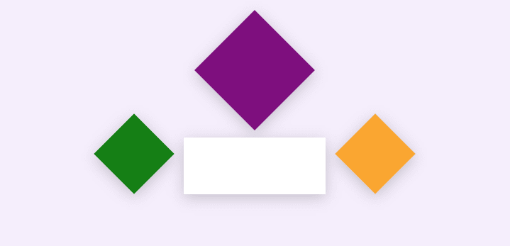
Exercise 2. Magical Cloud
This cloud is unusual. It's created with one rectangle and three squares: one div, two pseudo-elements, and one span.
<div class="FU_cloud">
  <span></span>
</div>
.FU_cloud{
  top: 60px;
  background: #fff;
  filter: drop-shadow(0px 5px 10px rgba(0,0,0,0.2));
  height: 80px;
  width: 200px;
  position: relative;
}

.FU_cloud:after,
.FU_cloud:before {
  content: '';
  position: absolute;
  background: #fff;
  width: 80px;
  height: 80px;
  transform: rotate(45deg);
  top:-17px;
}
.FU_cloud:before {
  background: green;
  left: -110px;
}
.FU_cloud:after {
  background: orange;
  right: -110px;
}
.FU_cloud span {
  width: 120px;
  height: 120px;
  transform: rotate(45deg);
  background: purple;
  top: -155px;
  margin: 0 auto;
  display: block;
  z-index: 1;
  position: relative;
}
We have the same situation as in the first cloud. We need to slide the elements together and change the background to white.
<div class="FU_cloud">
  <span></span>
</div>
.FU_cloud{
  top: 30px;
  background: #fff;
  filter: drop-shadow(0px 5px 10px rgba(0,0,0,0.2));
  height: 80px;
  width: 200px;
  position: relative;
}

.FU_cloud:after,
.FU_cloud:before {
  content: '';
  position: absolute;
  background: #fff;
  width: 80px;
  height: 80px;
  transform: rotate(45deg);
  top:-17px;
}
.FU_cloud:before {
  left: -40px;
}
.FU_cloud:after {
  right: -40px;
}
.FU_cloud span {
  width: 120px;
  height: 120px;
  transform: rotate(45deg);
  top: -64px;
  margin: 0 auto;
  display: block;
  background: #fff;
  z-index: 1;
  position: relative;
}

Exercise 3. Weather Images
Let's get our hands dirty. We will create two images: a basic sunny cloud and a stormy, evil one. But don't worry, it's simple.
All images are based on this article.
First, we need to create a few components:
- cloud
- sun
- lightning bolt
Our base colour component is created similar to the way we did the first one.
<div class="cloudBase">
  <div></div>
</div>
.cloudBase {
  top: 30px;
  background: #fff;
  filter: drop-shadow(0px 5px 10px rgba(175, 215, 243, 0.6));
  height: 120px;
  width: 230px;
  position: relative;
  border-radius: 100px;
}

.cloudBase div {
  background: #fff;
  height: 120px;
  width: 120px;
  position: relative;
  top: -60px;
  margin: 0 auto;
  border-radius: 100%;
}

Cloud shadow
To create shadow, we need to duplicate our cloud with additional blur, colour it blue, and scale it down.
<div class="cloudWrap">
  <div class="cloudBase">
    <div></div>
  </div>
  <div class="cloudBaseShadow">
    <div></div>
  </div>
</div>
.cloudWrap {
  position: relative;
  z-index: 1;
}
.cloudBase {
  top: 30px;
  background: #fff;
  filter: drop-shadow(0px 5px 10px rgba(175, 215, 243, 0.6));
  height: 120px;
  width: 230px;
  position: relative;
  border-radius: 100px;
}

.cloudBase div {
  background: #fff;
  height: 120px;
  width: 120px;
  position: relative;
  top: -60px;
  margin: 0 auto;
  border-radius: 100%;
}

.cloudBaseShadow {
  position: absolute;
  top: 65px;
  left:0;
  right:0;
  background: #69C1F8;
  height: 120px;
  width: 230px;
  border-radius: 100px;
  filter: blur(15px);
  transform: scale(0.8);
  opacity: 0.4;
  z-index: 2;
}

.cloudBaseShadow div {
  background: #69C1F8;
  height: 120px;
  width: 120px;
  position: relative;
  top: -60px;
  margin: 0 auto;
  border-radius: 100%;
}

.cloudBaseShadow div:after,
.cloudBaseShadow div:before {
  content: '';
  position: absolute;
  background: #fff;
  height: 100px;
  width: 100px;
  filter: blur(16px);
  border-radius: 100%;
}
.cloudBaseShadow div:after {
  right: -12px;
  top: -20px;
}
.cloudBaseShadow div:before {
  right: -92px;
  top: 33px;
}

Step by step:
- Duplicate the cloud with a blue colour.
- Add blur.
- Scale it down - transform: scale(0.8).
- Add pseudo-elements - two white circles to mask our shadow.
Sun image
This is pretty simple: a circle with a shadow and a pseudo-element background to lighten our sun.
<div class="sun"></div>
.sun {
  width:120px;
  height: 120px;
  border-radius: 50%;
  background: linear-gradient(30deg, #ffb347, #fbeb36);
  position: relative;
  box-shadow: 0px -6px 36px 0px #fbeb36, 0px 0px 6px 0px #ffb347;
}
.sun:after {
  content: '';
  position: absolute;
  top:-3px;
  bottom:-3px;
  left:-3px;
  right:-3px;
  border-radius: 50%;
  filter: blur(10px);
  background: linear-gradient(30deg,rgb(251 235 54 / 30%) 20%,rgb(255 255 255 / 49%));
  z-index: 1;
}

Cloud and sun
Now we have to combine the sun, the cloud, and some additional sun flashes.
<div class="cloudWrap">
  <div class="cloudBase">
    <div></div>
  </div>

  <div class="cloudBaseShadow">
    <div></div>
  </div>
  <div class="sun"></div>
  <div class="flash"></div>
</div>
.cloudWrap {
  position: relative;
  z-index: 1;
}
.cloudBase {
  top: 30px;
  background: #fff;
  filter: drop-shadow(0px 5px 10px rgba(175, 215, 243, 0.6));
  height: 120px;
  width: 230px;
  position: relative;
  border-radius: 100px;
}

.cloudBase div {
  background: #fff;
  height: 120px;
  width: 120px;
  position: relative;
  top: -60px;
  margin: 0 auto;
  border-radius: 100%;
}

.cloudBaseShadow {
  position: absolute;
  top: 65px;
  left:0;
  right:0;
  background: #69C1F8;
  height: 120px;
  width: 230px;
  border-radius: 100px;
  filter: blur(15px);
  transform: scale(0.8);
  opacity: 0.4;
  z-index: 2;
}

.cloudBaseShadow div {
  background: #69C1F8;
  height: 120px;
  width: 120px;
  position: relative;
  top: -60px;
  margin: 0 auto;
  border-radius: 100%;
}

.cloudBaseShadow div:after,
.cloudBaseShadow div:before {
  content: '';
  position: absolute;
  background: #fff;
  height: 100px;
  width: 100px;
  filter: blur(16px);
  border-radius: 100%;
}
.cloudBaseShadow div:after {
  right: -12px;
  top: -20px;
}
.cloudBaseShadow div:before {
  right: -92px;
  top: 33px;
}

.sun {
  position: absolute;
  top: -50px;
  right: -20px;
  z-index: -1;
  width:120px;
  height: 120px;
  border-radius: 50%;
  background: linear-gradient(30deg, #ffb347, #fbeb36);
  box-shadow: 0px -6px 36px 0px #fbeb36, 0px 0px 6px 0px #ffb347;
}
.sun:after {
  content: '';
  position: absolute;
  top:-3px;
  bottom:-3px;
  left:-3px;
  right:-3px;
  border-radius: 50%;
  filter: blur(10px);
  background: linear-gradient(30deg,rgb(251 235 54 / 30%) 20%,rgb(255 255 255 / 49%));
  z-index: 1;
}

.flash {
  position: absolute;
  bottom: -40px;
  left: -20px;
  width: 60px;
  height: 60px;
  background: rgba(255,255,255,0.4);
  box-shadow: 0px 0px 6px 3px rgba(255,255,255,0.4);
  border-radius: 50%;
  z-index: 2;
}
.flash:before {
  content: '';
  width: 10px;
  height: 10px;
  background: #fff;
  box-shadow: 0px 0px 6px 3px rgba(255,255,255,0.4);
  border-radius: 50%;
  filter: blur(0px);
  position: absolute;
  top: 60px;
  left: -10px;
}

And that's it!
You can play with the sunny cloud on CodePen.
As you can see, creating this image took us only a few minutes of work. Moreover, creating another image based on this one can be even faster. So let's do this!
Lightning bolt
First of all, let's create a lightning bolt shape by merging two triangles. Now use two triangles and animate the shape with CSS.
<div class="lightningBolt"></div>
@keyframes flash{
  0%, to { opacity: 1; }
  4% { opacity: 0; }
  6% { opacity: .6; }
  8% { opacity: .2; }
  10% { opacity: .9; }
}

@keyframes float{
  0%, 100% { transform: translateY(0); }
  50% { transform: translateY(5px); }
}


.lightningBolt {
  position: absolute;
  z-index: 3;
  width: 80px;
  height: 20px;
  margin: 0 auto;
  left: 0;
  right: 0;
  bottom: -40px;
  animation: flash 3s infinite, float 3s ease-in-out infinite;
}

.lightningBolt:before,
.lightningBolt:after {
  content: '';
  position: absolute;
}
.lightningBolt:before {
  width: 0;
  height: 0;
  left: -4px;
  top: 5px;
  border-style: solid;
  border-width: 0px 13px 24px 70px;
  border-color: transparent transparent #fbeb36 transparent;
  transform: rotate(-60deg);
}
.lightningBolt:after {
  width: 0;
  height: 0;
  left: 4px;
  top: -40px;
  border-style: solid;
  border-width: 0px 13px 24px 70px;
  border-color: transparent transparent #fbeb36 transparent;
  transform: rotate(-60deg) scaleY(-1) scaleX(-1);
}

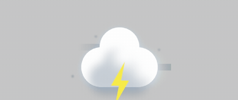
Storm cloud
Okay! Let's finish our cloud by combining our basic cloud (with grey background), the lightning, and some CSS for wind and water drops.
<div class="cloudWrap">
  <div class="cloudBase">
    <div></div>
  </div>
  <div class="cloudBaseShadow">
    <div></div>
  </div>
  <div class="wind"></div>
  <div class="lightningBolt"></div>
</div>
.cloudWrap {
  position: relative;
  z-index: 1;
}
.cloudBase {
  top: 30px;
  background: #fff;
  filter: drop-shadow(0px 5px 10px rgba(175, 215, 243, 0.6));
  height: 120px;
  width: 230px;
  position: relative;
  border-radius: 100px;
}

.cloudBase div {
  background: #fff;
  height: 120px;
  width: 120px;
  position: relative;
  top: -60px;
  margin: 0 auto;
  border-radius: 100%;
}

.cloudBaseShadow {
  position: absolute;
  top: 65px;
  left:0;
  right:0;
  background: #5B7186;
  height: 120px;
  width: 230px;
  border-radius: 100px;
  filter: blur(15px);
  transform: scale(0.8);
  opacity: 0.4;
  z-index: 2;
}

.cloudBaseShadow div {
  background: #5B7186;
  height: 120px;
  width: 120px;
  position: relative;
  top: -60px;
  margin: 0 auto;
  border-radius: 100%;
}

.cloudBaseShadow div:after,
.cloudBaseShadow div:before {
  content: '';
  position: absolute;
  background: #fff;
  height: 100px;
  width: 100px;
  filter: blur(16px);
  border-radius: 100%;
}
.cloudBaseShadow div:after {
  right: -12px;
  top: -20px;
}
.cloudBaseShadow div:before {
  right: -92px;
  top: 33px;
}


@keyframes flash{
  0%, to { opacity: 1; }
  4% { opacity: 0; }
  6% { opacity: .6; }
  8% { opacity: .2; }
  10% { opacity: .9; }
}

@keyframes float{
  0%, 100% { transform: translateY(0); }
  50% { transform: translateY(5px); }
}


.lightningBolt {
  position: absolute;
  z-index: 3;
  width: 80px;
  height: 20px;
  margin: 0 auto;
  left: 0;
  right: 0;
  bottom: -40px;
  animation: flash 3s infinite, float 3s ease-in-out infinite;
}

.lightningBolt:before,
.lightningBolt:after {
  content: '';
  position: absolute;
}
.lightningBolt:before {
  width: 0;
  height: 0;
  left: -4px;
  top: 5px;
  border-style: solid;
  border-width: 0px 13px 24px 70px;
  border-color: transparent transparent #fbeb36 transparent;
  transform: rotate(-60deg);
}
.lightningBolt:after {
  width: 0;
  height: 0;
  left: 4px;
  top: -40px;
  border-style: solid;
  border-width: 0px 13px 24px 70px;
  border-color: transparent transparent #fbeb36 transparent;
  transform: rotate(-60deg) scaleY(-1) scaleX(-1);
}

.wind {
  position: absolute;
  top: 20px;
  left: -10px;
  width: 90px;
  height: 20px;
  background: linear-gradient(-90deg,rgb(91 113 134 / 0.4),transparent);
  z-index: -1;
}
.wind:before {
  content: '';
  width: 60px;
  height: 20px;
  background: linear-gradient(90deg,transparent,rgb(91 113 134 / 0.4));
  position: absolute;
  top: 60px;
  right: -190px;
}
.wind:after {
  content: '';
  position: absolute;
  top: 0;
  left: 0;
  right: 0;
  bottom: 50%;
  border-radius: 100%;
  width: 8px;
  height: 8px;
  z-index: 1;
  filter: blur(2px);
  z-index: 1;
  box-shadow:
  50px -30px 2px rgb(91 113 134 / 0.4),
  -20px 90px 0px rgb(91 113 134 / 0.4),
  240px 10px 2px rgb(91 113 134 / 0.4);
  animation: float 3s ease-in-out infinite;
}
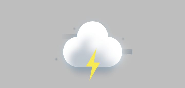
You can play with the storm cloud on CodePen.
Homework
Now you know how to create awesome weather images, so create your own! Snow? Blizzard? Fog, maybe? Share you codepen on Twitter with #frontendunicorns hashtag!
Thanks for reading!
You can follow me on social media or sign up for my newsletter!
🐦 Twitter
👨🏻💻 Blog
📰 Medium
💌 Newsletter
🦄 Frontend Unicorn book


Latest comments (9)
Beautiful ;
this is creative and super useful !!
There will be more articles in this series 😎 Follow me here on dev.to or join my newsletter to be always up to date ✌️
this is incredible!!!
Thank you! ❤️
💗It!!
Thank you! 🦄
This is awesome! 🦄
Nice use of shadows 🔥🔥