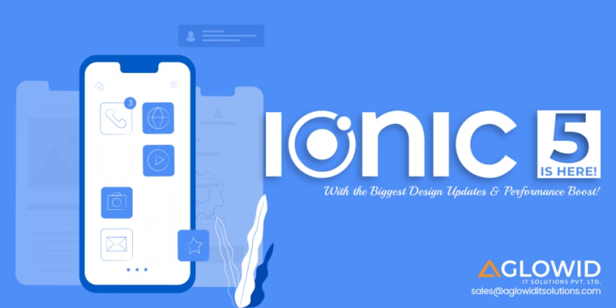
The app development platform, Ionic came up with its most anticipated update ‘Ionic 5’ with exciting features including new UI components, gestures, custom animations API, icons, colors, themes and much more. Most importantly, the latest release brings up with iOS 13 design updates as well as official React and Angular integrations.
In this article, we shall be discussing everything about Ionic 5, its updates, features, and functionalities. We shall also understand how the new release will bring a revolutionary impact on cross-platform development. But before that, lets check this tweet published by ionic and its team.
IONIC 5 IS HERE!
The biggest design update ever in the history of Ionic:
New iOS & Android component designs
New React & Angular starters
Latest Ionicons icon pack
New Animations APICheck the Blog for the full story and get building!
https://t.co/rAvmCeVqxI
— ionic (@Ionicframework) February 11, 2020

Let’s begin with…
How to Upgrade Ionic 5
When any technology comes up with major version release, it ensures that it does not involve any complex processes so that users can easily upgrade it. Ionic 5 applies the same policies, and the release is easy to update. The new version use Web components, so the changes in API are separate from the changes in UI components and JavaScript. At the same time, if you are using the previous version of Ionic, such as Ionic 4, then upgrading is quite easy.
If you want to upgrade it right now, you should update the Ionic 4 release (4.11.10). It will ensure that there is no deprecation warnings specific to your app in the developer console. Then you are ready to go ahead using the following the command;
for an angular app
npm i @ionic/angular@latest –save
for a react app
npm i @ionic/react@latest –save
npm i @ionic/react-router@latest –save
npm i ionicons@latest –save
for a stencil / vanilla JS app
npm i @ionic/core@latest –save
Note: You can also take help of its official website with the migration guide.

iOS Design Updates
Ionic 5 has come up with a massive design upgrade, considering the recent release of Apple’s iOS 13. You can feel the changes across UI components that the Ionic has done provided to make it compatible and matched to the native iOS. Here are a list of changes in the Components;
Segment Received New Design
As the iOS 13 came up with complete makeover in iOS 13 release, Ionic 5 has considered it in this release has brought a drastic change in iOS Segment design. All the difference and changes that Ionic 5 has for iOS design are clearly visible in the image given below;
Previously (before iOS 13), there used to be borders and filled background to suggest the checked and unchecked buttons while the latest one (iOS 13) comes up with a single drag indicator that slides between buttons to show status.
Header with Collapsing Title
The new design upgrade includes the properties which enable the shrinking large, small, and collapsible title. The upgrade makes the Ionic 5 compatible with the iOS 13’s collapsible header with different size options. When you use the Ionic five, you don’t need to different size options, but it will do it automatically.
Large Title/Small Title
When you scroll the page, after a certain point, the title collapse into the different size, though you have the option not to use collapsing. The standard title is placed above the content while the large one within the content. When you scroll the content above, the large title will be transformed into the standard one. Take a look in the image given below;
As far as the small title is concerned, it is known as the header note, which you can see within and between the toolbars. The small title are often standard-sized, used combining with Swipe to Close Modals. Swipe the Close Modals are mainly visible in iOS devices as you can see the pages, instead of requiring tap to close the button, enables the users to push back the page, and it will inset with the page behind it. You can see the effect in the next points given below.
Menu Overlay Design
iOS in its previous version, there used to be ‘reveal’ type menu, which a user can push over the main content to see the menu while the new design came with a new feature that will overlay the content. Here’s how it happens;
Pull Page to Refresh
Refresher is now above the header with the large title. The spinner tick is given, which will help users understand how much the page needs to be pulled down. Material Design refresher has also received the refresher implying the same logic.
Similarly, the List headers also received an upgrade based on the iOS 13 design. You can see the image given below compare it with the previous iOS updates;

list-header-light

List header dark
Also Check out our Article : How Ionic Cut Down Your Mobile App Development Cost
Open Source Animations Utility
Ionic, with a view to allowing developers to create highly performant animations, introduced open-source animations utility named as Ionic Animations. It will have tools that developers require while building the animations.
Icons Library with Loaf New Icons
Developers can utilize the free and open-source Icon library introduced in Ionic 5 as Ionicons.
Today, we are thrilled to announce…
IONICONS V5
Over 1200 hand crafted icons
Three distinct form variants
Platform specific controlCheck out what’s new in this latest release
— ionic (@Ionicframework) February 6, 2020
However, to the use icons, you need to follow the changes it has come up with;
- No separate set of icons for different modes
- Icons available in three new variants, which range from ‘outline,’ ‘fill,’ and ‘sharp.’
- If you are using two different modes, then icons will not change according to the mode
- You can set the icon per mode, but you need to utilize ‘ios’ and ‘md’ properties

Ionicons 5
Ionic Colors
Ionic comes with new Ionic Colors as default so that developers can get unique colors automatically if they have created using starters. App developed with Angular and ReactJS, then developers need to define it in the theme/variables.scss file. Developers can make use not only to the default colors but also to the recommended one as well when you use this in dark mode.

ionic-colors

Ionic dark colors
Also Check out our Article : Cross-Platform App Development Challenges & Solutions
Starters Get New Look
Starters in Ionic received a complete makeover along with the components. You can see the changes in the list of starters given below;


Customization
Ionic, adding more CSS variables and converting scoped components to Shadow DOM, has made it easier to customize or style. Here are the list of components converted to Shadow DOM;
- Back Button
- Card
- Segment
- Split Pane
Shadow DOM is used for its ability to allow customization without affecting the other components. At the same time, when Shadow DOM is used, it enables to use of CSS custom properties and allows easier theming, which in fact, was missing in the previous major release.
As far as scoped components are concerned, it allows CSS variables too, but it makes users override stiff. In such a case of replacing the Ionic components, developers will have two option left, either utilize ‘!important’ in the CSS style or write an overly complicated selector.
You can learn more on to this topic from the Ionic’s support page here.
Angular Ivy
Angular released its most anticipated version 9, with Ivy as added render, recently and Ionic followed with a set of changes, making the Ionic 5 fully compatible with Angular’s Ivy. Ivy enables developers to keep the bundle size smaller and improve loading time and performance.
Also Check out our Article : Google Rolls Out Angular 9 with Major Changes – Check Now
Final Thoughts
In short, you have open-source Ionic 5 with the most advanced features and usability. Stay tuned for the more new updates.


Top comments (0)