

This post contributed to the AG Grid blog by Arek Nawo
Bootstrap is one of the most popular CSS frameworks, so it’s no surprise that many libraries integrate it with the top JavaScript UI frameworks. One such library is React-Bootstrap.
React-Bootstrap provides Bootstrap-powered React components with built-in reactivity. Every component is compatible with Bootstrap themes, optimized for accessibility, and can be controlled with React props. As one of the oldest React component libraries, React-Bootstrap is an excellent choice for building modern, responsive UI.
In this article, you’ll learn how to integrate React-Bootstrap with AG Grid, a batteries-included JavaScript grid with first-party React integration. You’ll see how easy it is to use both tools to build a compelling, user-friendly UI.
You can find the complete code for this tutorial in this GitHub repo.
AG Grid vs. React-Bootstrap Table
Before getting into the code, you should know the differences between AG Grid and React-Bootstrap’s built-in Table component.
At its core, the Table component is a traditional HTML table with a header, body, rows, and cells. React-Bootstrap makes the often-tedious process of creating an HTML table easier, not only with React’s reactivity and JSX but also with a faster styling process. You can set basic styles, add a row hover effect or dark theme, and make the table responsive with just a few props. However, it’s still a simple table that’s meant for basic use cases.
On the other hand, AG Grid is a full-blown, high-performance grid library. It provides you with everything you need to create an advanced, highly interactive grid-based UI, including filtering, data streaming, charting, and more. It’s your go-to solution if you need anything beyond a static table.
Using AG Grid with React-Bootstrap
To get started, make sure you’ve got NPM v7 and Node.js v12.2.0 or newer installed. Then, run the following commands to scaffold your project using Vite—a fast ES module-based bundler—and install necessary dependencies:
npm create vite project --template react
cd project
npm install
npm install bootstrap react-bootstrap ag-grid-community ag-grid-react
The installed dependencies include the following:
- React-Bootstrap and “vanilla” Bootstrap for CSS styles loading
- AG Grid’s core “community” package and React Data Grid for rendering
To start the development server, use npm run dev.
Creating Card Container
To learn how to integrate React-Bootstrap with AG Grid, you’ll build a simple app listing countries to visit. You use React-Bootstrap to add functionality and visuals to the grid with images and buttons.
Inside the src/App.jsx file, you initialize AG Grid together with React-Bootstrap. Start by creating a Bootstrap card for holding the grid:
import Card from "react-bootstrap/Card";
import Stack from "react-bootstrap/Stack";
import "bootstrap/dist/css/bootstrap.min.css";

const App = () => {
  return (
    <Card body className="h-100">
      <Stack className="h-100">
        <Card.Title>Countries to visit</Card.Title>
        [Grid]
      </Stack>
    </Card>
  );
};

export default App;
Using the Card and Stack components, you just built a full-height card with vertically stacked content. The grid will be placed just below the title.
To center the card in the body, add some CSS in the src/index.css file:
html {
  height: 100%;
  width: 100%;
}
body {
  margin: 0;
  padding: 1rem;
  height: 100%;
}
#root {
  margin: auto;
  height: 100%;
  width: 100%;
  max-width: 48rem;
}
With these changes, the card should now look like this:

Creating Basic AG Grid
To add the grid to the setup, you have to create a data source, which can be done using the useState() hook:
// ...
import { useState } from "react";
// ...

const App = () => {
  const [columnDefs] = useState([
    {
      headerName: "Country",
      field: "country",
    },
    {
      headerName: "Image",
      field: "image",
      flex: 1,
    },
    {
      headerName: "Visited",
      field: "visited",
    },
  ]);
  const [rowData] = useState([
    {
      country: "United Kingdom",
      image:
        "https://images.unsplash.com/photo-1486299267070-83823f5448dd?ixlib=rb-1.2.1&ixid=MnwxMjA3fDB8MHxwaG90by1wYWdlfHx8fGVufDB8fHx8&auto=format&fit=crop&w=2371&q=80",
      visited: false,
    },
    {
      country: "United States",
      image:
        "https://images.unsplash.com/photo-1501594907352-04cda38ebc29?ixlib=rb-1.2.1&ixid=MnwxMjA3fDB8MHxwaG90by1wYWdlfHx8fGVufDB8fHx8&auto=format&fit=crop&w=2832&q=80",
      visited: false,
    },
    {
      country: "India",
      visited: false,
      image:
        "https://images.unsplash.com/photo-1524492412937-b28074a5d7da?ixlib=rb-1.2.1&ixid=MnwxMjA3fDB8MHxwaG90by1wYWdlfHx8fGVufDB8fHx8&auto=format&fit=crop&w=2371&q=80",
    },
    {
      country: "Canada",
      visited: false,
      image:
        "https://images.unsplash.com/photo-1519832979-6fa011b87667?ixlib=rb-1.2.1&ixid=MnwxMjA3fDB8MHxwaG90by1wYWdlfHx8fGVufDB8fHx8&auto=format&fit=crop&w=2353&q=80",
    },
    {
      country: "Brazil",
      visited: false,
      image:
        "https://images.unsplash.com/photo-1483729558449-99ef09a8c325?ixlib=rb-1.2.1&ixid=MnwxMjA3fDB8MHxwaG90by1wYWdlfHx8fGVufDB8fHx8&auto=format&fit=crop&w=2370&q=80",
    },
    {
      country: "Germany",
      visited: false,
      image:
        "https://images.unsplash.com/photo-1554072675-66db59dba46f?ixlib=rb-1.2.1&ixid=MnwxMjA3fDB8MHxwaG90by1wYWdlfHx8fGVufDB8fHx8&auto=format&fit=crop&w=2373&q=80",
    },
    {
      country: "France",
      visited: false,
      image:
        "https://images.unsplash.com/photo-1431274172761-fca41d930114?ixlib=rb-1.2.1&ixid=MnwxMjA3fDB8MHxwaG90by1wYWdlfHx8fGVufDB8fHx8&auto=format&fit=crop&w=2370&q=80",
    },
  ]);

  // ...
};
// ...
Each data row contains the name of the country, a related Unsplash image URL, and a Boolean indicating whether it was already visited. In addition, columnDefs define how the grid’s columns should be structured—e.g., their headers and width. In this case, all columns are displayed as text, with the image column taking the remaining horizontal space with flex: 1.
To display the grid, use the AgGridReact component passing the row data, column definition, and any additional properties—rowHeight in pixels in this case—as props:
// ...
import { AgGridReact } from "ag-grid-react";
import "ag-grid-community/dist/styles/ag-grid.css";
import "ag-grid-community/dist/styles/ag-theme-material.css";
// ...

const App = () => {
  // ...
  return (
    <Card body className="h-100">
      <Stack className="h-100 ag-theme-material">
        <Card.Title>Countries to visit</Card.Title>
        <AgGridReact
          columnDefs={columnDefs}
          rowData={rowData}
          rowHeight={200}
        ></AgGridReact>
      </Stack>
    </Card>
  );
};

// ...
The grid also comes with CSS of its own, which you also have to import. The ag-theme-material class on the grid’s wrapper indicates what theme to use.
The grid is now ready, but it displays all columns as text:

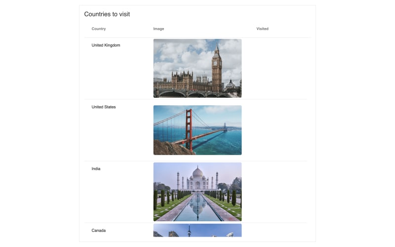
Let’s use React-Bootstrap and replace URLs with images.
Displaying Images
To display images in the grid, you’ll have to create a new component to be used as a cell renderer.
Create a new file at src/ImageRenderer.jsx with the following content:
import Image from "react-bootstrap/Image";
import Stack from "react-bootstrap/Stack";

const ImageRenderer = (props) => {
  return (
    <Stack direction="horizontal" className="h-100">
      <Image rounded src={props.getValue()} className="h-auto w-100" />
    </Stack>
  );
};

export default ImageRenderer;
Cell-renderer components receive data about the grid and current cell as props. You can use props.getValue() to get the cell’s current value, an image URL in this example. This value is then provided to React-Bootstrap’s Image component, along with other props. Additional Bootstrap class names and horizontally aligned Stack assure centered positioning and grid-adjusted sizing of the image.
To use ImageRenderer in the grid, return to src/App.jsx and set it as a cell renderer for the image column:
// ...
import ImageRenderer from "./ImageRenderer";
// ...

const App = () => {
  const [columnDefs] = useState([
    {
      headerName: "Country",
      field: "country",
    },
    {
      headerName: "Image",
      field: "image",
      flex: 1,
      // Set ImageRenderer component as cell renderer
      cellRenderer: ImageRenderer,
    },
    {
      headerName: "Visited",
      field: "visited",
    },
  ]);
  // ...
};

// ...
With these improvements, the grid already looks a lot better:
Adding Toggle Buttons
Besides seeing images, the user should be able to mark countries as visited. Currently, the visited column is empty as it contains only Boolean false values. To show a toggle button instead, create a new cell renderer at src/VisitedRenderer.jsx :
import ToggleButton from "react-bootstrap/ToggleButton";

const VisitedRenderer = (props) => {
  return (
    <ToggleButton
      size="sm"
      id={`visited-${props.rowIndex}`}
      type="checkbox"
      variant={props.getValue() ? "outline-primary" : "outline-secondary"}
      checked={props.getValue()}
      value="1"
      onChange={(e) => {
        props.setValue(e.currentTarget.checked);
      }}
    >
      {props.getValue() ? "YES" : "NO"}
    </ToggleButton>
  );
};

export default VisitedRenderer;
Using React-Bootstrap’s ToggleButton, you can easily create a button-style checkbox. The button is styled and labeled according to the prop’s value, which is set on every toggle with props.setValue().
Pay special attention to the id prop. It’s important for it to be unique, as React-Bootstrap uses it as an HTML id attribute, matching the underlying <input> checkbox and button-styled <label>.
Now all you have to do is load the cell renderer in src/App.jsx , and you should see toggle buttons appear in the column:
// ...
import VisitedRenderer from "./VisitedRenderer";
// ...

const App = () => {
  const [columnDefs] = useState([
    {
      headerName: "Country",
      field: "country",
    },
    {
      headerName: "Image",
      field: "image",
      flex: 1,
      cellRenderer: ImageRenderer,
    },
    {
      headerName: "Visited",
      field: "visited",
      // Set VisitedRenderer component as cell renderer
      cellRenderer: VisitedRenderer,
    },
  ]);
  // ...
};

// ...

Customizing Column Header
One of many great things about AG Grid is that it’s very customizable, far beyond custom cell renderers. You can utilize this customizability together with React-Bootstrap to build—e.g., custom column headers with different functionalities.
Setting up External Filter
For this example, you’ll build a custom header for the visited column with the ability to filter the list for only the visited countries. Start by adding an external filter to the grid in src/App.jsx :
import { useEffect, useState, useRef } from "react";
// ...

const App = () => {
  const gridRef = useRef();
  const [filterEnabled, setFilterEnabled] = useState(false);
  // ...
  const doesExternalFilterPass = (node) => {
    return node.data.visited;
  };

  useEffect(() => {
    if (gridRef.current && gridRef.current.api) {
      gridRef.current.api.onFilterChanged();
    }
  }, [filterEnabled]);

  return (
    <Card body className="h-100">
      <Stack className="h-100">
        <Card.Title>Countries to visit</Card.Title>
        <div className="ag-theme-material h-100 w-100">
          <AgGridReact
            ref={gridRef}
            columnDefs={columnDefs}
            rowData={rowData}
            rowHeight={200}
            doesExternalFilterPass={doesExternalFilterPass}
            isExternalFilterPresent={() => filterEnabled}
          ></AgGridReact>
        </div>
      </Stack>
    </Card>
  );
};

// ...
In AG Grid, external filters allow you to mix your custom filtering logic with the mechanisms already integrated into the grid. To enable them, you have to provide two additional props:
-
doesExternalFilterPass: This is the actual filter function; given a node, it should return a Boolean indicating whether or not to include the row in the result. -
isExternalFilterPresent: This is a function returning a Boolean that informs the grid about the presence of the external filter.
In the code above, the external filter is controlled by a filterEnabled state property and a doesExternalFilterPass() function, which extracts the visited boolean from row data to filter the grid.
To make the grid process the filter accordingly on filterEnabled change, you must first inform it about a change in the filter configuration using api.onFilterChanged().
The api object is accessible on the grid element; thus, you should use the useRef() hook to create a reference to it first. Then, with the useEffect() hook, call api.onFilterChanged() every time filterEnabled changes.
Adding Toggle Button Header
With the external filter ready, now it’s just a matter of creating a custom header component that will set filterEnabled.
In src/VisitedHeader.jsx , create the following component:
import { useState, useEffect } from "react";
import ToggleButton from "react-bootstrap/ToggleButton";

const VisitedHeader = (props) => {
  const [checked, setChecked] = useState(false);

  useEffect(() => {
    props.setFilterEnabled(checked);
  }, [checked]);

  return (
    <ToggleButton
      id="filter-visited"
      type="checkbox"
      variant={checked ? "outline-primary" : "outline-secondary"}
      checked={checked}
      value="1"
      onChange={(e) => {
        setChecked(e.currentTarget.checked);
      }}
    >
      Visited
    </ToggleButton>
  );
};

export default VisitedHeader;
VisitedHeader once again uses React-Bootstrap’s ToggleButton with custom id and value-based styling. On top of that, it has its own state property, checked, to keep track of the toggle button. The parent component is notified about every change with the useEffect() and setFilterEnabled() method passed through the props.
Back in the src/App.jsx file, you should set the header component and pass the required setFilterEnabled prop:
// ...
import VisitedHeader from "./VisitedHeader";
// ...

const App = () => {
  // ...
  const [columnDefs] = useState([
    {
      headerName: "Country",
      field: "country",
    },
    {
      headerName: "Image",
      field: "image",
      flex: 1,
      cellRenderer: ImageRenderer,
    },
    {
      headerName: "Visited",
      // Set VisitedHeader component as header component
      headerComponent: VisitedHeader,
      // Pass additional props to the header component
      headerComponentParams: {
        setFilterEnabled,
      },
      field: "visited",
      cellRenderer: VisitedRenderer,
    },
  ]);

  // ...
};

// ...
It’s worth noting that AG Grid also provides a distinctive headerComponentParams property to pass custom props to the header component (aside from the grid-provided ones). The component itself can be set using the headerComponent property.
The final result looks like this:

Conclusion
In this article, you’ve learned how you can use AG Grid and React-Bootstrap together, as well as how customizable AG Grid really is. By using AG Grid’s React Data Grid, you not only get a great, highly advanced grid view but also easy access to the ecosystem of the leading JS UI framework. With such powerful tools, the only limit to your app is your imagination.
AG Grid is the leading JavaScript Grid. It should be your go-to open source tool whenever you need a batteries-included grid solution, with advanced features like live data streaming, charting, editing, and more. Check out AG Grid’s official documentation to learn more.


Top comments (0)